Colours have the remarkable power to sway our emotions and shape our perceptions. They hold the ability to create atmosphere, evoke specific feelings, and inspire action, all without saying a single word. As designers, marketers and business owners, understanding the psychology of colour is crucial to creating compelling visuals that resonate with your target audience. In fact, studies show that as much as 90% of people form their initial impressions of a brand based solely on its colour. In this blog post, we’ll explore the fascinating relationship between colour and emotions, unlocking the secrets that can amplify your brand’s impact and engagement.
What is Colour Psychology?
Before we dive into the profound effects of colours on emotions, let’s grasp the fundamentals of colour psychology – the study of how certain colours impact human behaviour. It’s important to understand that each colour carries a unique meaning, associations and psychological effects, which can vary widely across cultures and personal experiences. Colour psychology involves the use of colour theory – the practical application of mixing and matching various hues – to explore concepts like colour perception and the effect of colour combinations.
Warm Colours: Energize, Captivate and Inspire Action
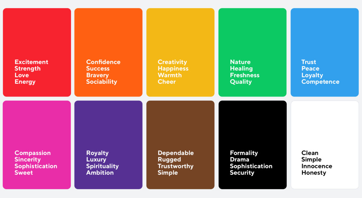
Our response to colour is influenced by its brightness, shade, tint, and whether it falls into the warm or cool spectrum. Warm colours like red, orange and yellow are known to ignite passion, energy, and enthusiasm. Red, often associated with love and excitement, can easily grab attention and stimulate urgency. Orange, a vibrant and inviting hue, exudes warmth and creativity, making it ideal for encouraging interaction. Yellow, reminiscent of sunshine, evokes happiness and optimism, creating a sense of positivity and confidence. Warm colours also have an activating effect, signalling danger or prompting action, as seen in stop signs and caution tape. Red, in particular, can even stimulate hunger, which is why it’s favoured by many fast-food chains.
Cool Colours: Calm, Soothe and Convey Trust
Cool colours such as blue, green, and purple have a more calming and soothing effect on our emotions. Blue, the colour of the sky and ocean, represents tranquility, trust, and stability. It is commonly used by businesses aiming to build credibility and reliability. Green, associated with nature and growth, promotes a sense of balance, harmony, and renewal. Purple, often associated with luxury and creativity, can evoke a feeling of mystery and inspire imagination. These hues are frequently chosen by brands promoting health, beauty, or security.
Neutrals: Simplicity, Sophistication, and Versatility
Neutrals, including black, white, grey, and brown, possess their own emotional significance. Black, symbolizing power and elegance, can add a touch of sophistication to your branding. White represents purity, simplicity, and cleanliness, providing a fresh canvas for creativity. Grey, a versatile colour, conveys neutrality and balance, making it ideal for minimalist designs. Brown exudes warmth, reliability, and a sense of stability, appealing to brands aiming for a down-to-earth image.
Cultural and Contextual Influences
While colours have universal meanings to some extent, it’s crucial to consider cultural and contextual influences. Different cultures may associate colours with varying emotions or symbolic representations. Additionally, the context in which colours are used, such as industry or target audience, can shape their perceived meanings. For example, red may symbolize luck and celebration in some cultures, while representing danger or warning in others.
Applying Colour Psychology in Design and Marketing
Now that we understand the emotional impact of different colours, how can we effectively apply this knowledge to design and marketing strategies? Here are some practical tips:
- Understand your target audience and their cultural backgrounds to align colours with their preferences and associations.
- Choose colours that align with your brand values and the emotions you want to evoke in your customers.
- Create colour palettes that complement each other harmoniously, considering the emotions and messages you want to convey.
- Test and iterate your colour choices through A/B testing and gathering feedback to ensure they resonate with your audience.
- Keep in mind the colour psychology principles when designing logos, websites, advertisements, and product packaging to create a cohesive and emotionally engaging brand experience.
Colours are not just visually pleasing elements; they have the power to evoke emotions, shape perceptions, and drive action. By understanding the psychology of colours, we can tap into their emotional impact and create designs that resonate with our audience on a deeper level. So, next time you embark on a design project or develop a marketing campaign, remember the profound relationship between colours and emotions. Use this knowledge to craft compelling visuals that captivate hearts, inspire action, and leave a lasting impression.
Ready to make colour work for you? Get started today and watch your brand come to life!


