The New Front of House for Harry's Bar & Restaurant
Harry’s Bar has been a longstanding neighborhood favorite in San Fransisco’s historic Pacific Heights District. With its dark mahogany wood bar, timeless artwork and antique accents Harry’s has an elegant and inviting atmosphere that makes diners feel instantly comfortable. For over 30 years it’s been a fixture in the local community, appealing to a younger clientele that gathers for a drink after work or for a long night of entertainment and celebration. To keep their booths and stools occupied, Harry’s has always used social media to engage and inform. However, their outdated website was slow to load and with important information difficult to find. Harry’s came to us for an improved website that centralizes restaurant information, shares details on menus and events, and gives diners a place to make quick, online reservations.
The National Restaurant Association reported over 1 million restaurants in the United States in 2018. That same year over 200 million U.S. consumers visited a sit-down restaurant, with over 57% of those guests looking up restaurant websites before choosing where to dine. Recent trends in internet and mobile browsing prove that a user-friendly website is an absolutely essential ingredient for success in the restaurant business. Here’s how we designed a custom website for Harry’s that brought their unique dining ambiance to the internet, enticing diners to come over and grab a seat.
WHAT WE DID
Custom Website
Social Media Integration
Search Engine Optimisation
Restaurant Website Design
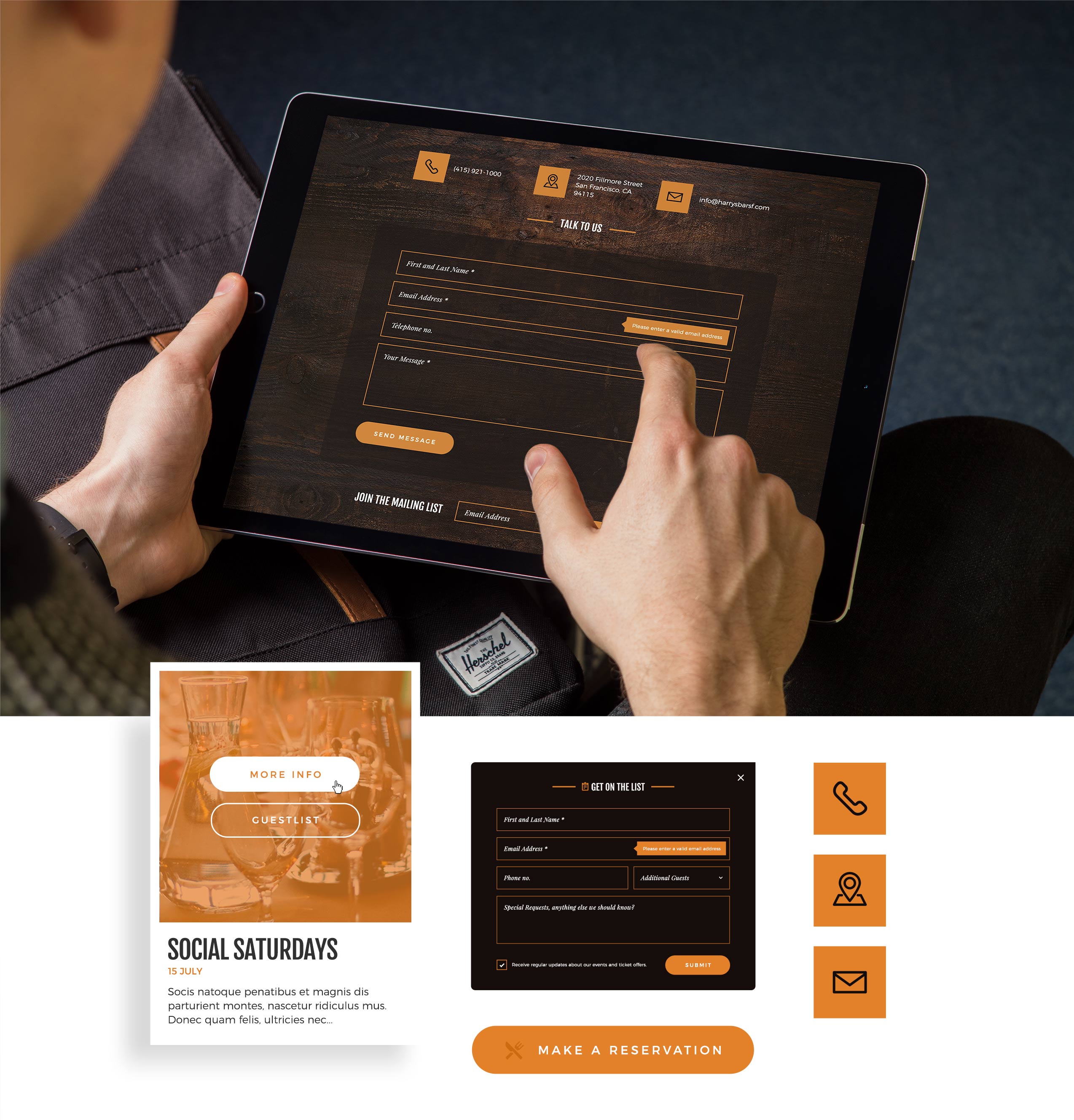
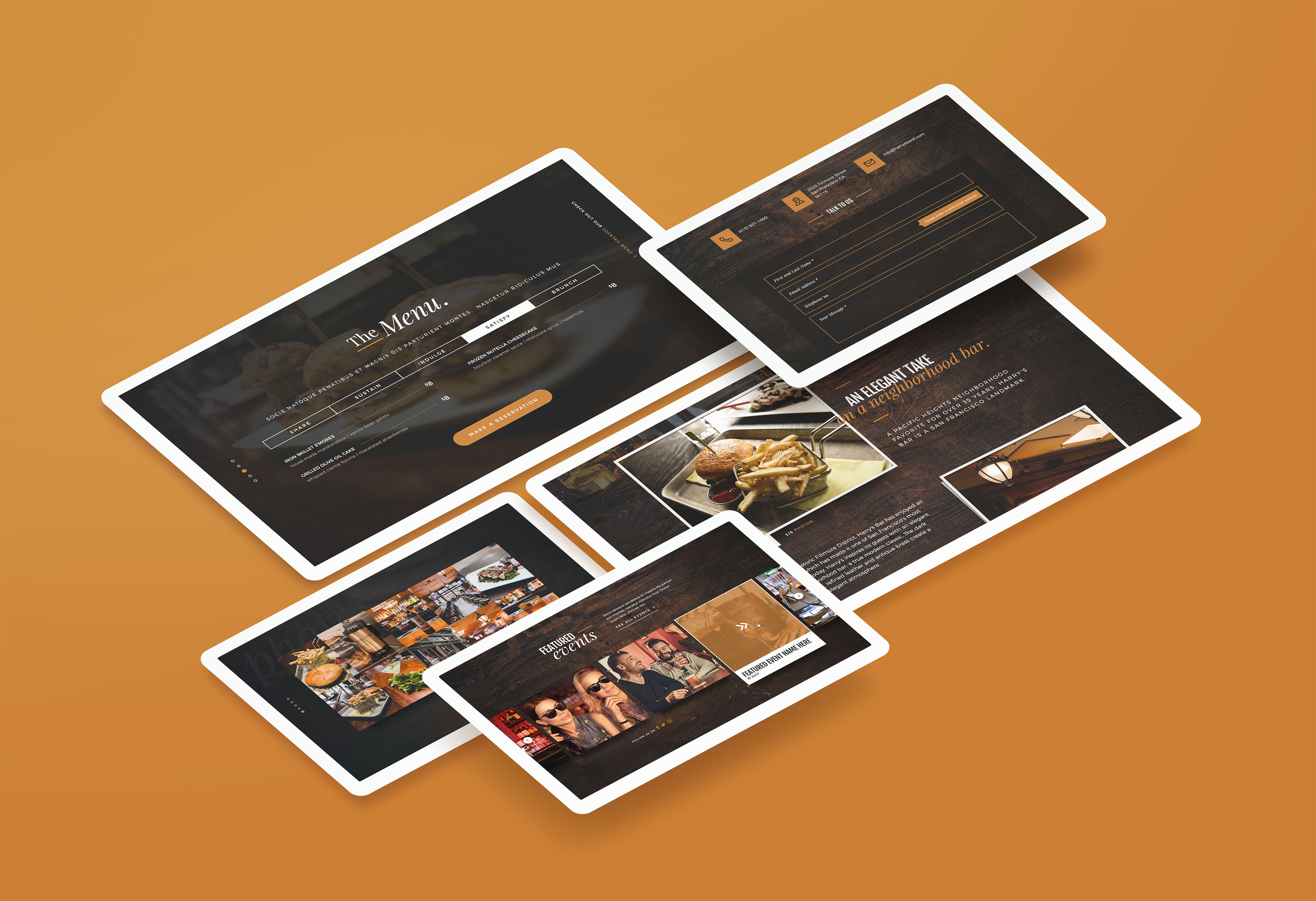
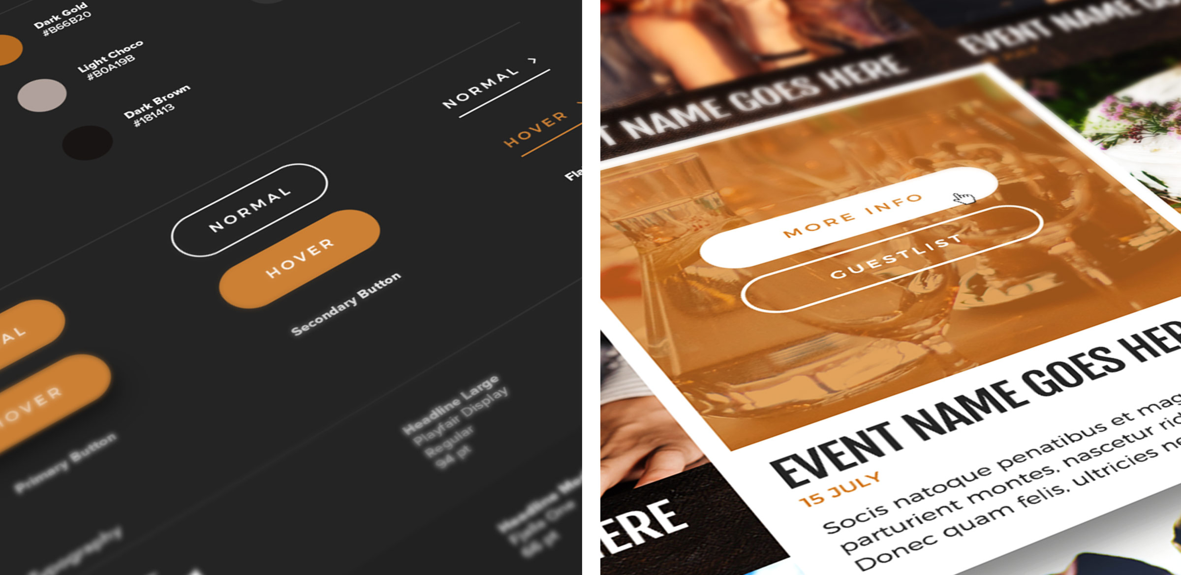
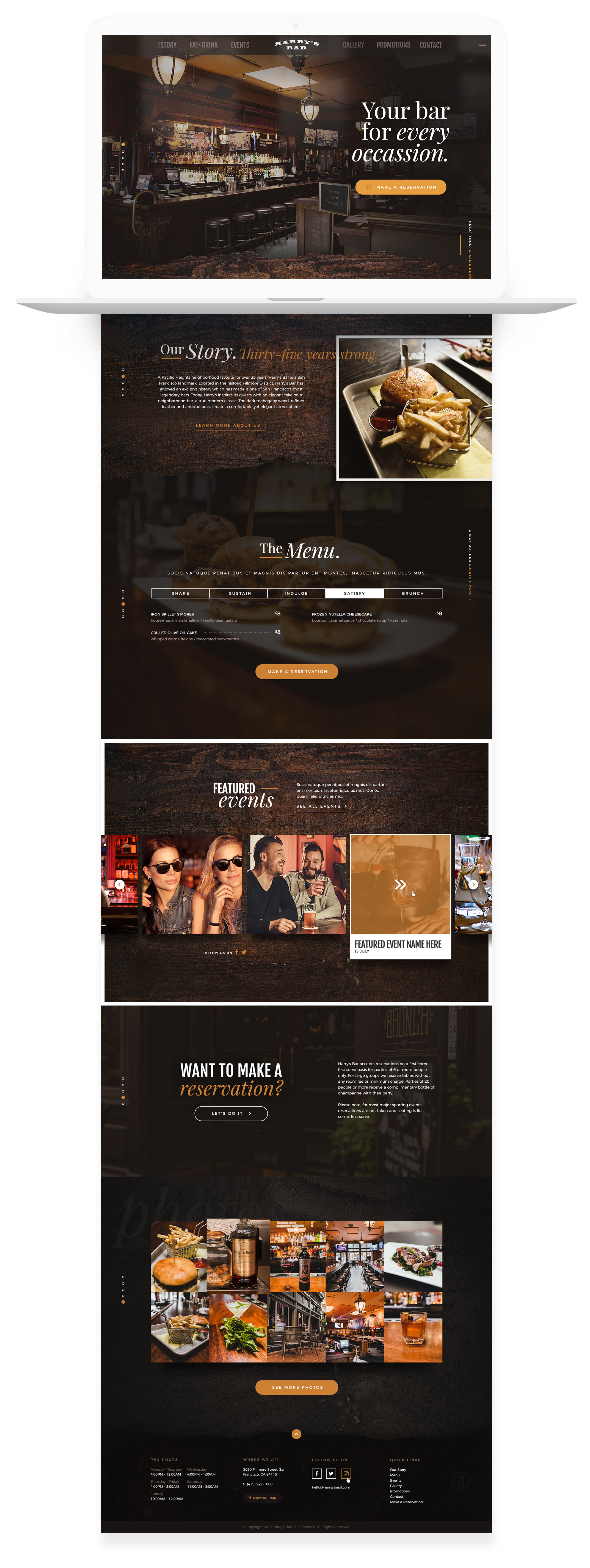
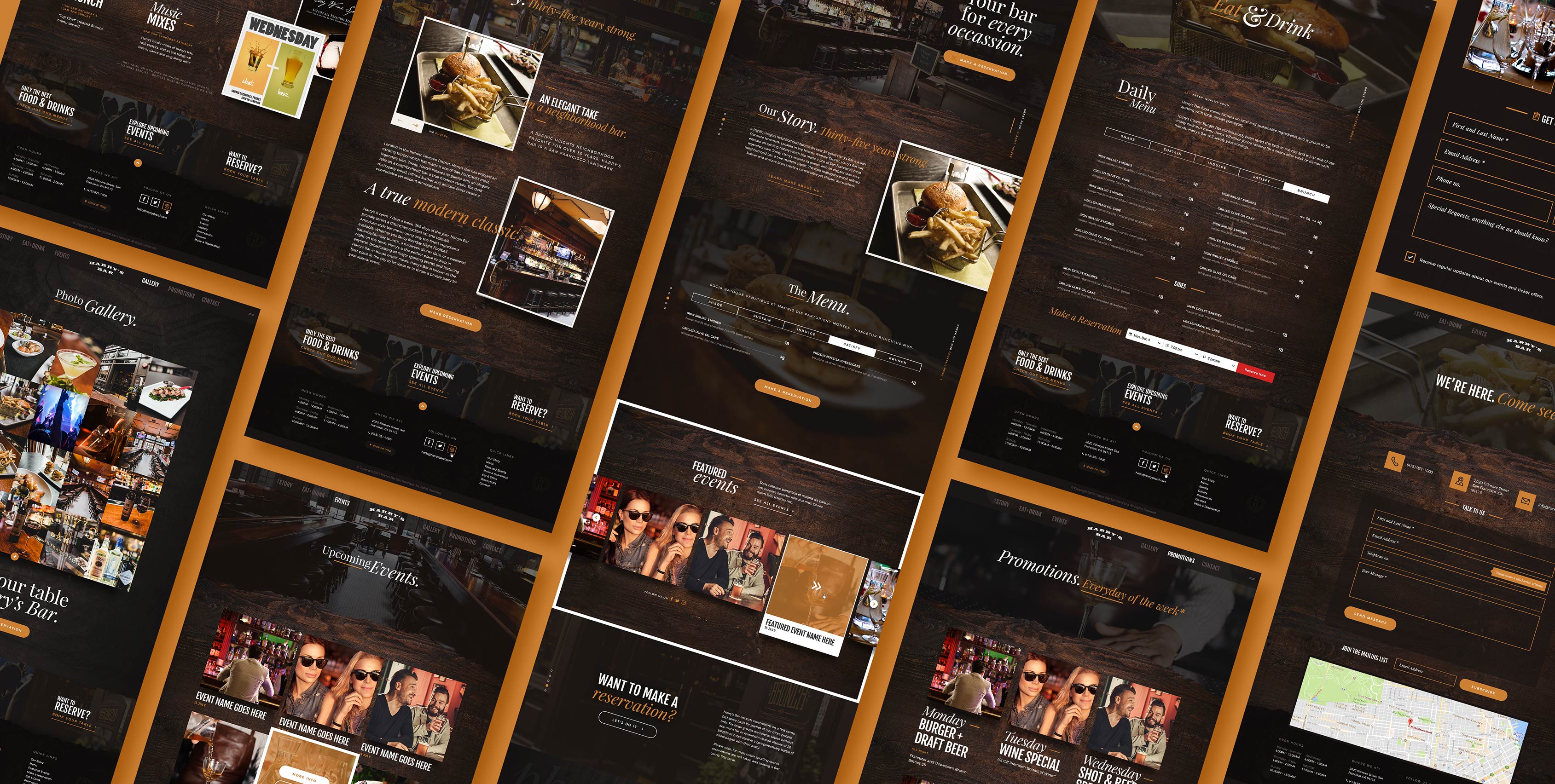
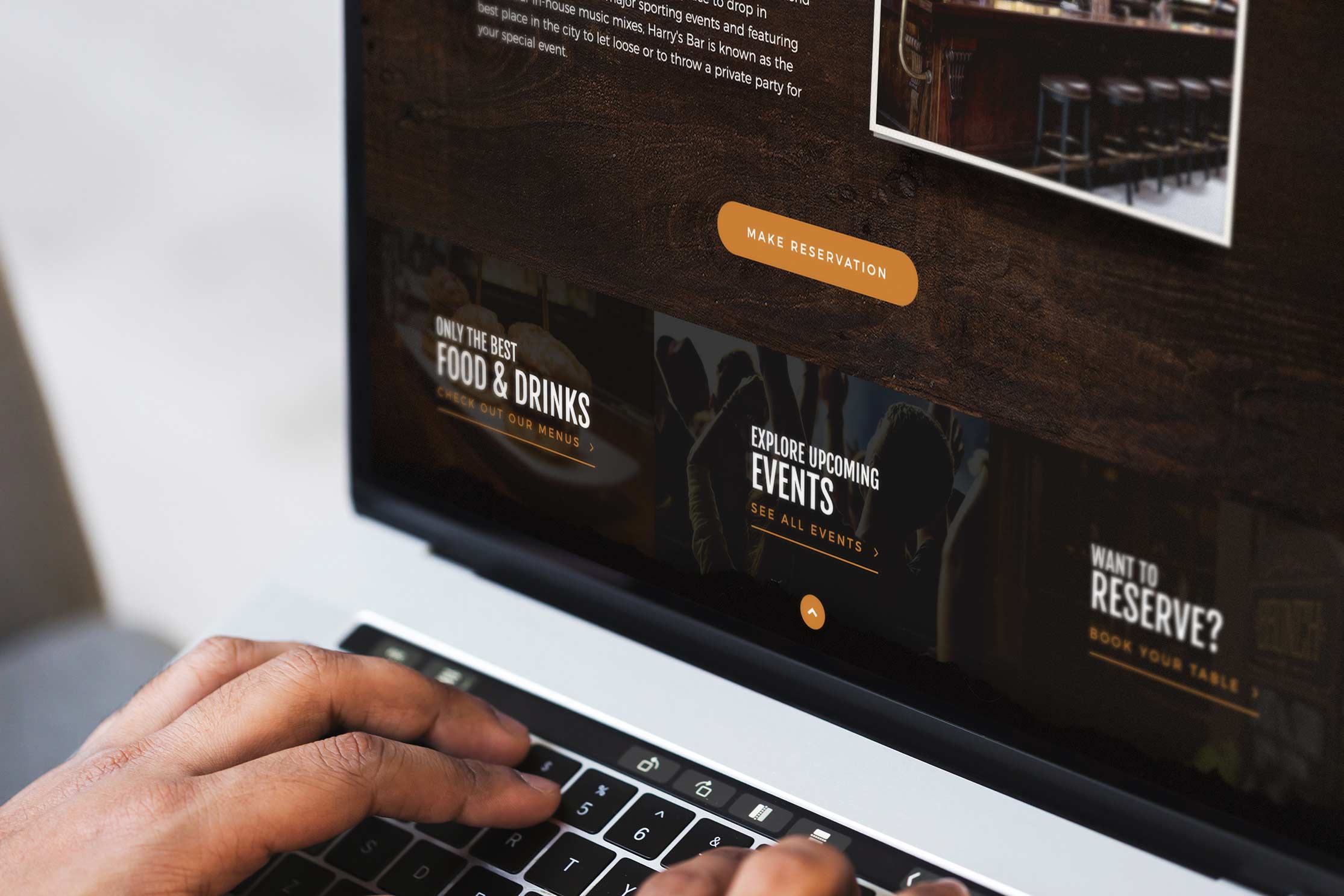
Good restaurant website design caters to user-experience first and has a functional, balanced design that also reflects the dining ambiance, giving us a taste of what to expect. Key information like menus, location, hours of operation and contact info is placed in an intuitive layout with clear calls-to-action. In effect, the website experience gives us a clear sense of what Harry’s is all about, their service and quality of food using custom design and user-experience elements.
Browsing Can Be a Memorable Experience
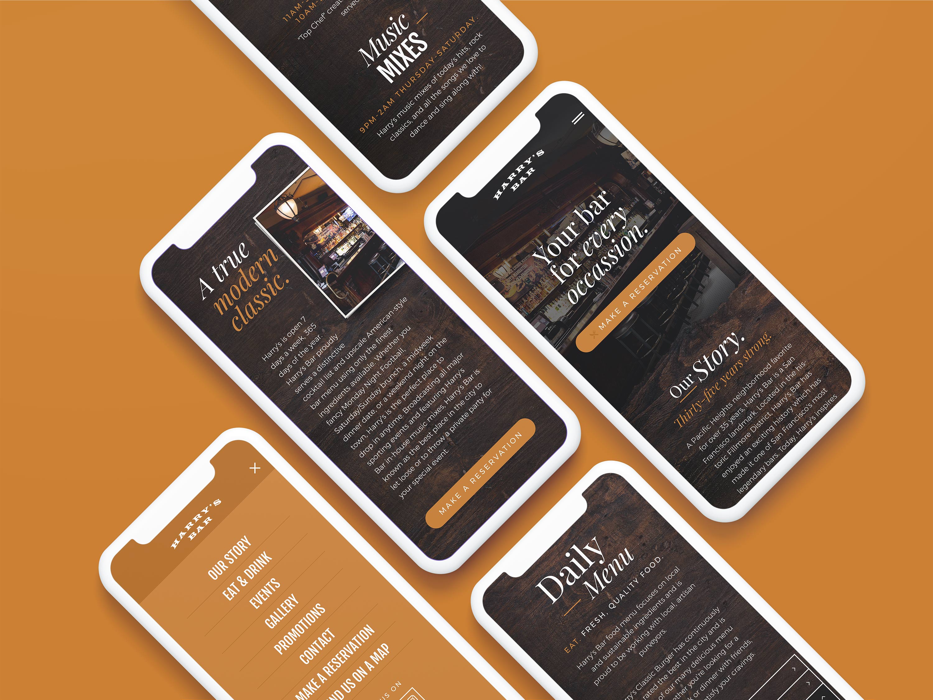
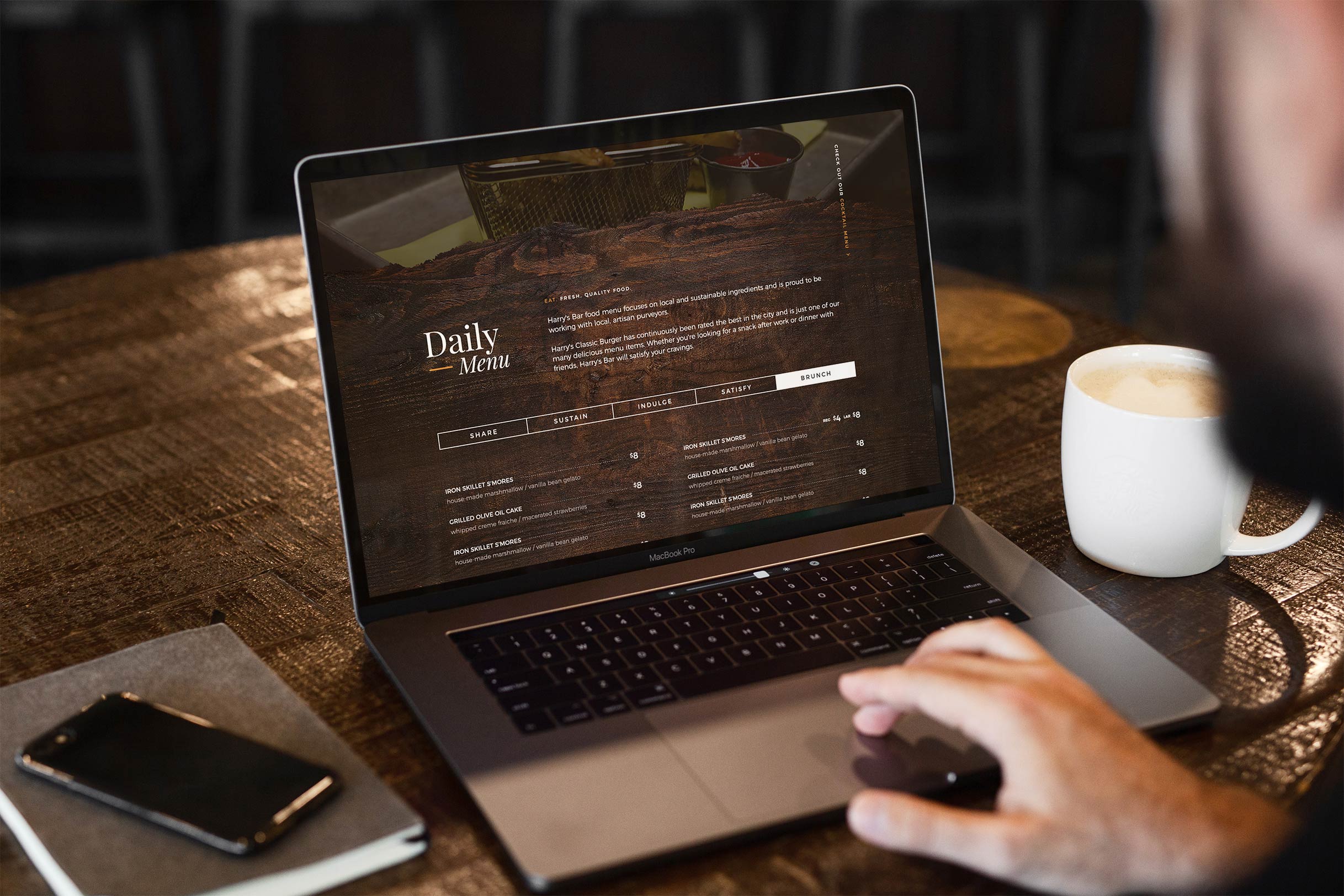
The website’s background layer is an opaque woodgrain texture that reminds us again, of the mahogany bar. Parallax scrolling creates an engaging 3D effect and a nice, subtle element of depth for a truly unique and memorable website experience. The dark tones are the perfect backdrop for the photography, featuring mouth-watering menu items and favorite cocktails. The featured Instagram feed showcases enticing posts of food and events, further enticing us to head on over. The home page optimizes precious screen space by arranging critical information within a scroll’s reach. Making an online reservation takes a single click. For those seeking more information, pages dedicated to menus, events, promotions, photos, and contact details present information in an easy to navigate layout.
It Starts on Mobile
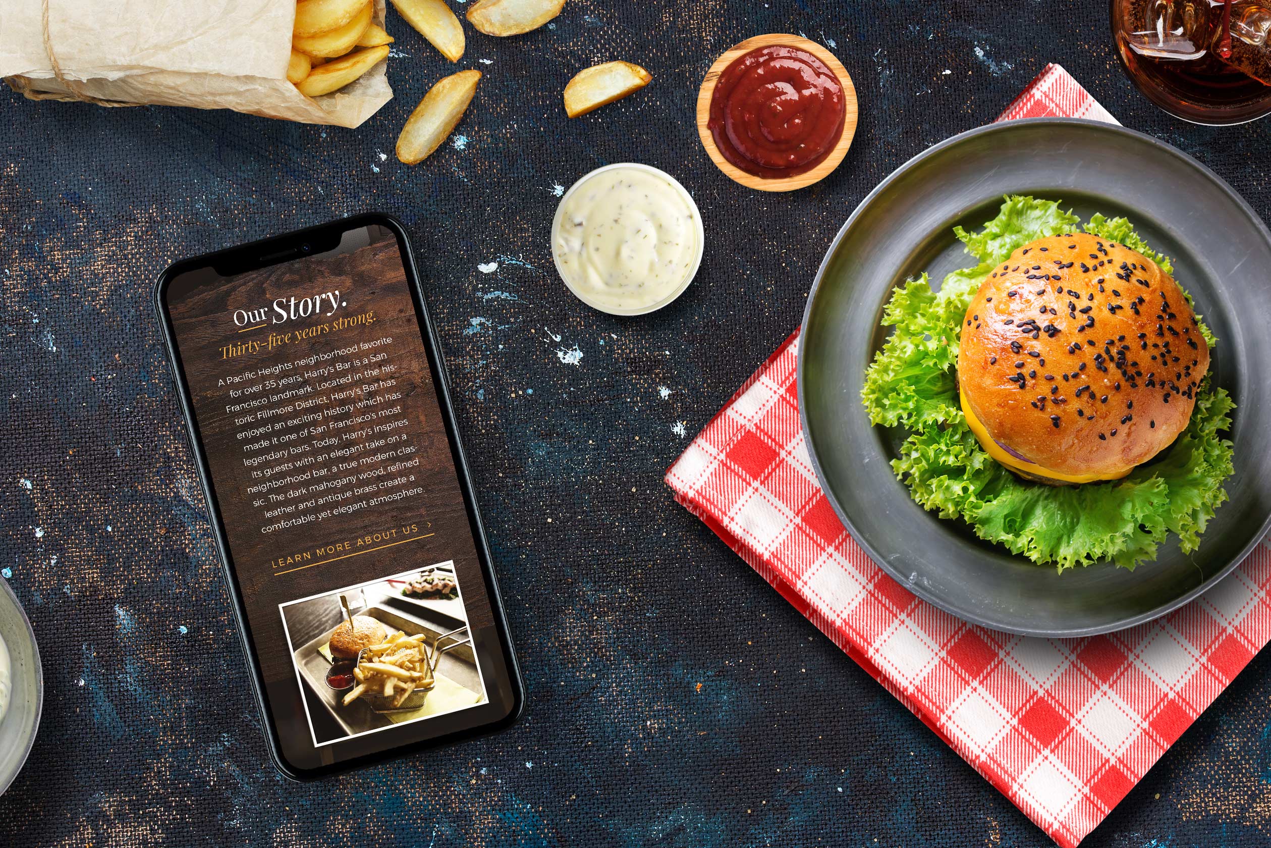
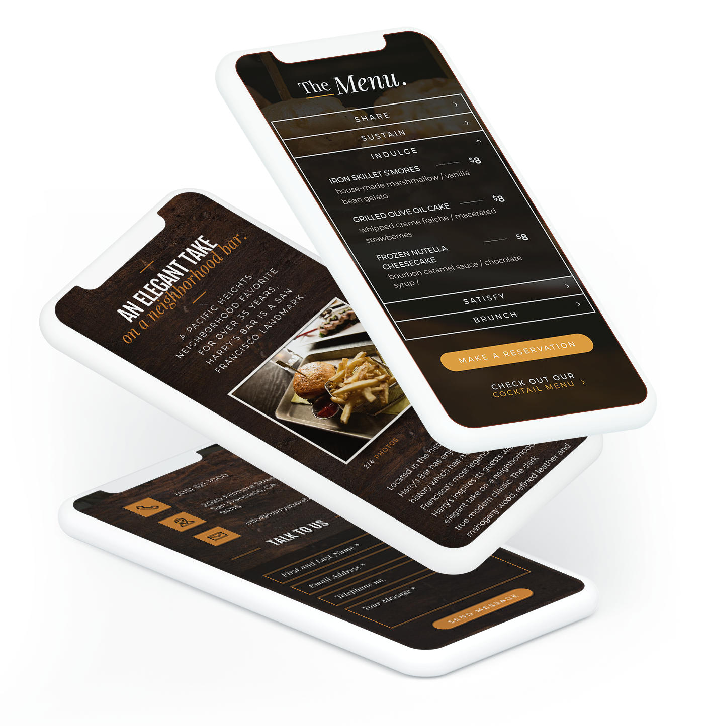
In the US, over 7% of online searches for restaurants are done on mobile devices. This statistic is the reason why so many restaurant chains and franchise operations are launching their own mobile apps. While independent restaurant owners don’t necessarily need to invest in a dedicated app, having a mobile-ready website is absolutely necessary. Our design is mobile-ready, loading within seconds and adjusting to any screen size.
