Blog

A Strategic Brand Redesign
Superior Communications manufactures and distributes mobile accessories to major wireless carriers and big box retailers. Since their beginnings in the early 90s Superior has grown its service offering through acquiring distribution centres, developing sustainable packaging solutions, and establishing an Innovations Lab for product design and development.
Over time Superior’s national footprint and corporate specialties have grown and diversified considerably, now operating three unique lines of business and several OEM product lines. Their earlier branding and corporate website were outdated and did not represent their technical innovation. Superior came to us to rebrand their corporate identity, build a new corporate website and refresh their sales & marketing collateral.
Here’s how we helped.
WHAT WE DID
Branding
Custom Website Design
Web Development
Content Management System (CMS)
Content Copywriting
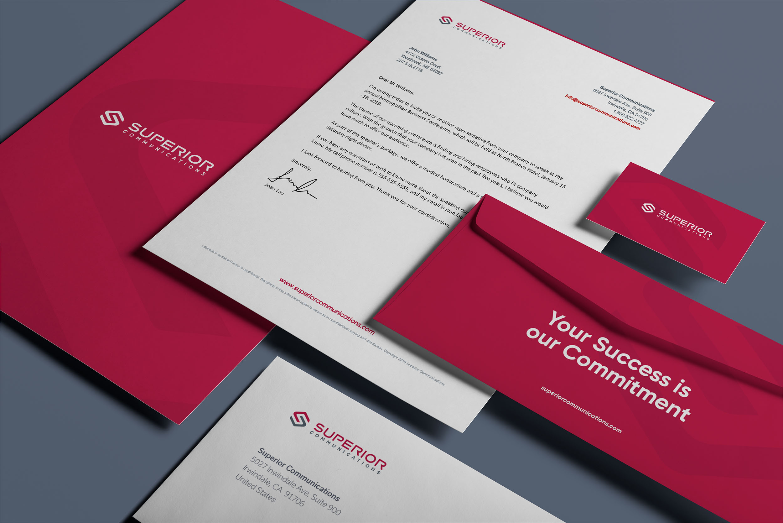
Sales Collateral
Finding the Right Balance
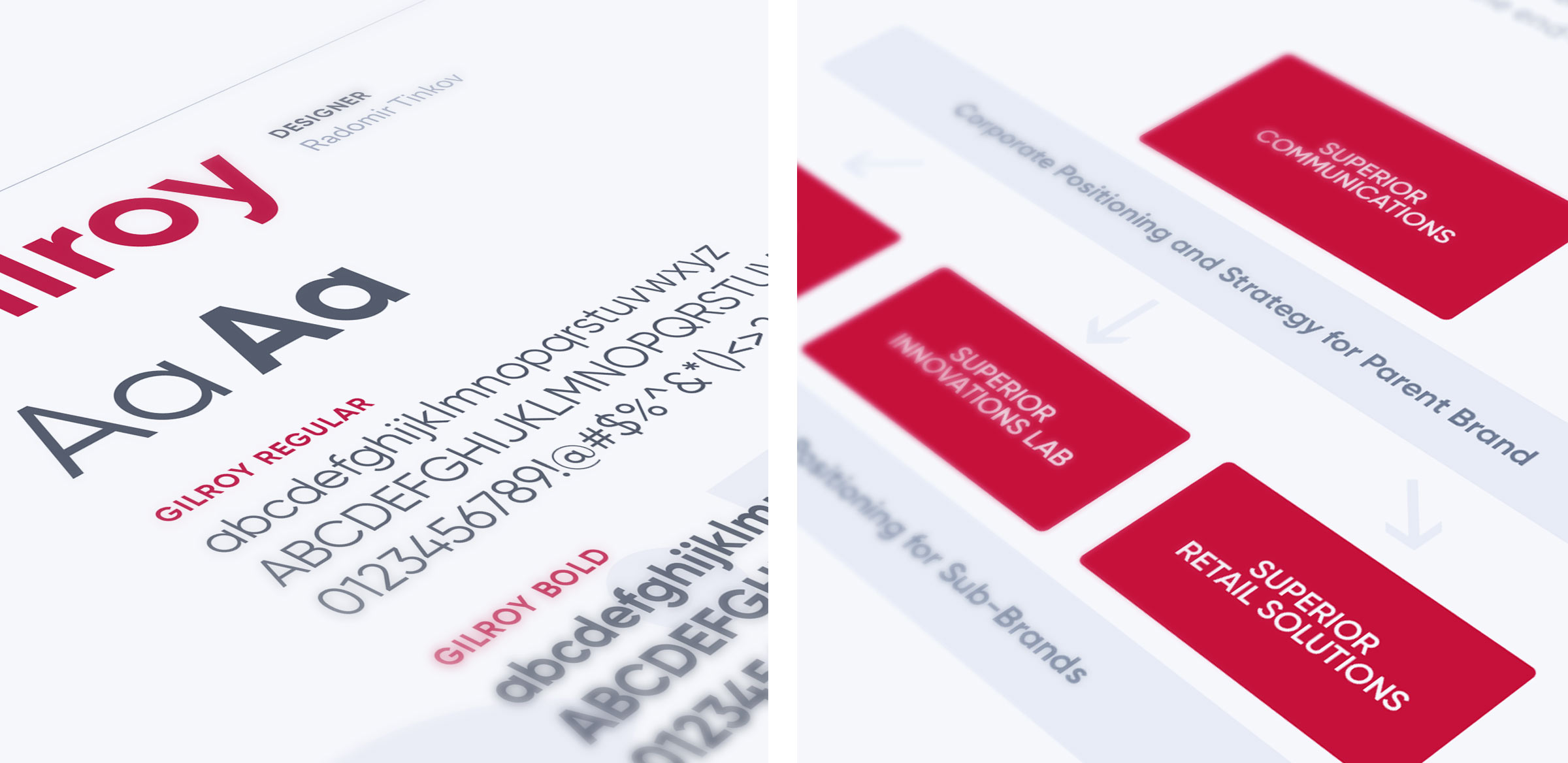
Superior had a decades long reputation in their target market and they wanted to maintain recognition while discarding dated elements that no longer served. The brand architecture was refined to draw focus to individual areas of specialization: logistics and distribution, retail solutions, and product design. The parent brand needed to be relatable to these distinct identities while maintaining an overarching presence, all-encompassing presence.
To strike this delicate balance we led workshop sessions with the executive team and focus groups with employees and partners. The goal was to understand how the brand was currently being perceived in the market, what was working and what wasn’t. We identified and fine tuned organizational core values and developed a verbal messaging framework that resonated through the organization. We also conducted extensive research on their competitors and develop a comprehensive understanding of their target market. This allowed us to identify key areas where Superior could differentiate themselves.
Redesign with Purpose
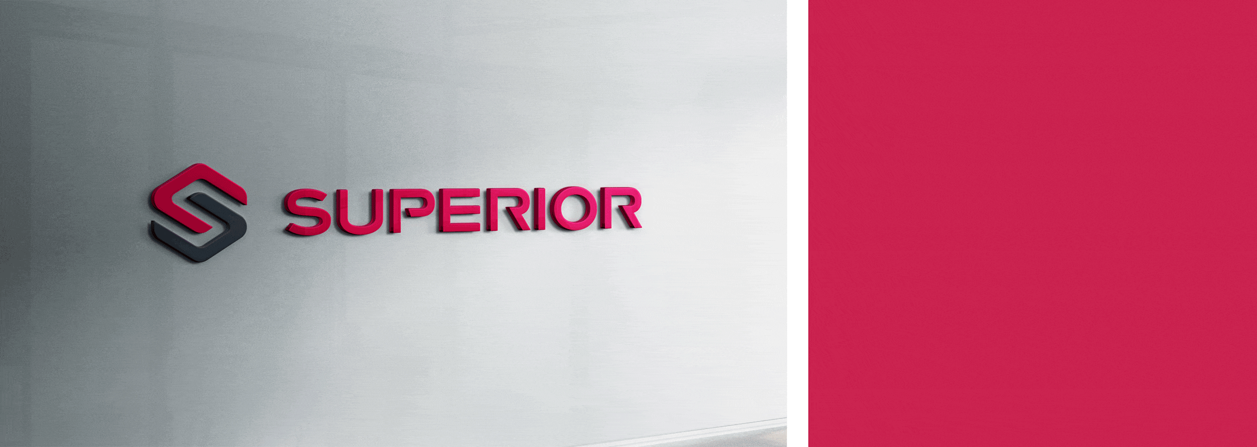
Superior wanted to maintain elements of recognition in their new logo while also having a redesign that was distinct and meaningful. To help achieve this balance we presented multiple rounds of logo concepts, exploring a variety of representations until we found one that felt just right.
We went for a bold and dynamic aesthetic with dimension and movement. The logo emblem consists of interlocking elements that create the letter S in the negative space, representing the different parts of the organization that come together to create the whole. The business name is commanding in capital letters and a stacked layout allows the design to translate across various media. The new logo is highly visible and easily recognizable, while still conveying the quality and sophistication of Superior’s branding.
Rejuvenating a Legacy B2B Brand
Superior’s new identity had to represent legacy while rejuvenating its connections with its employees, community and customers. This where branding can help set the narrative and influence business reputation. Our visual identity does exactly that with through design, color palette and typography. We incorporated elements that depict professionalism and trustworthiness, while pushing for dynamism and creativity. We applied these elements across all representations of the brand, from corporate signage to swag. The new logo is easy to replicate across all media, and stands out in all representations.
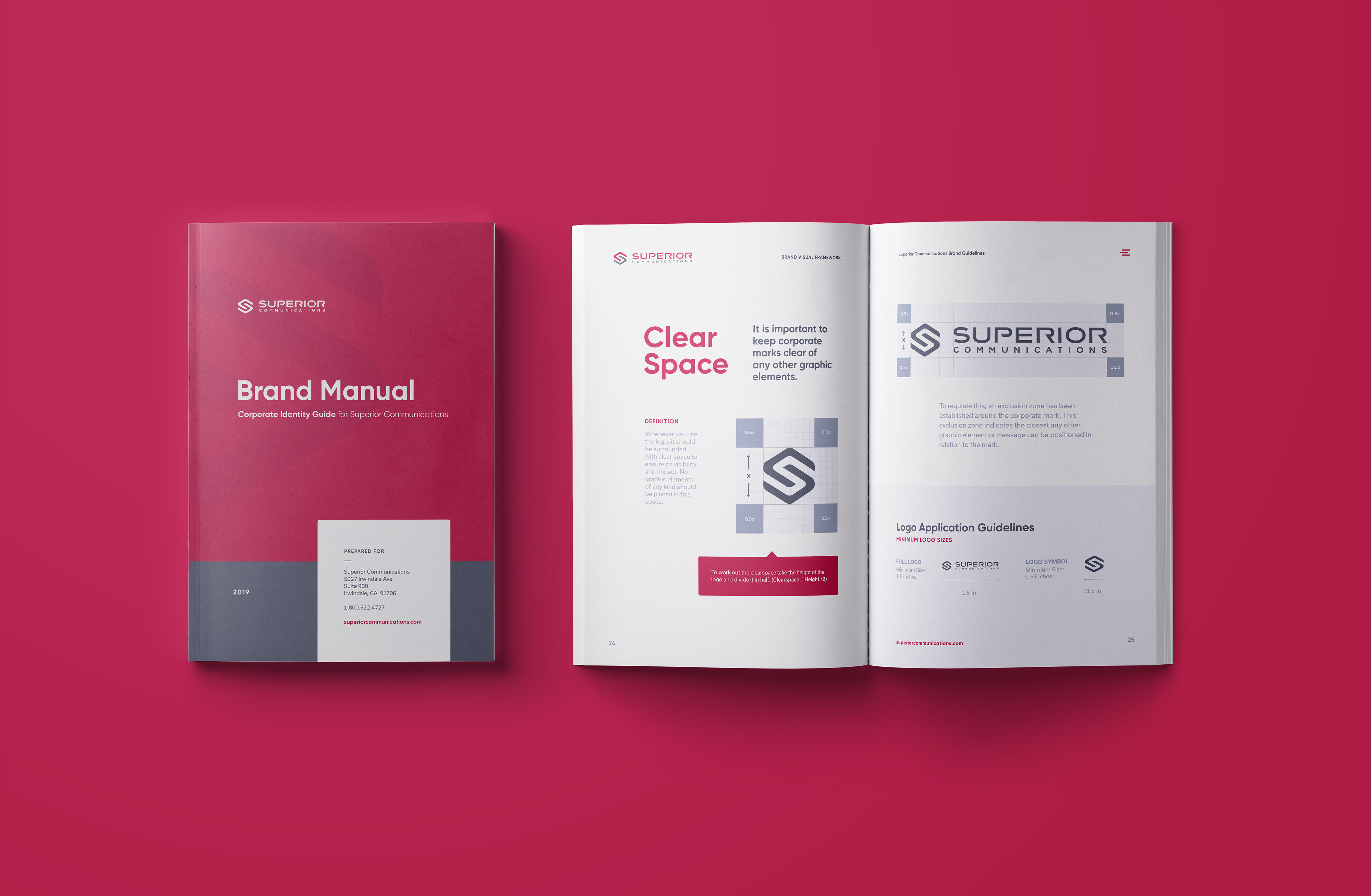
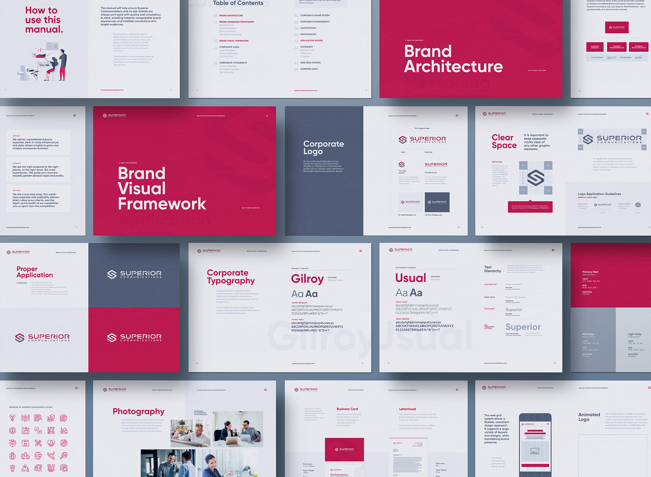
Brand Style Guide
Once the branding refresh was complete, we created a brand style guide to assist internal teams, vendors and partners in how to apply the brand consistently across all materials. The style guide includes guidelines for their logo usage, color palette, typography, and more, empowering Superior to maintain a cohesive look that is professional and high quality.
A Streamlined Website Rebuild
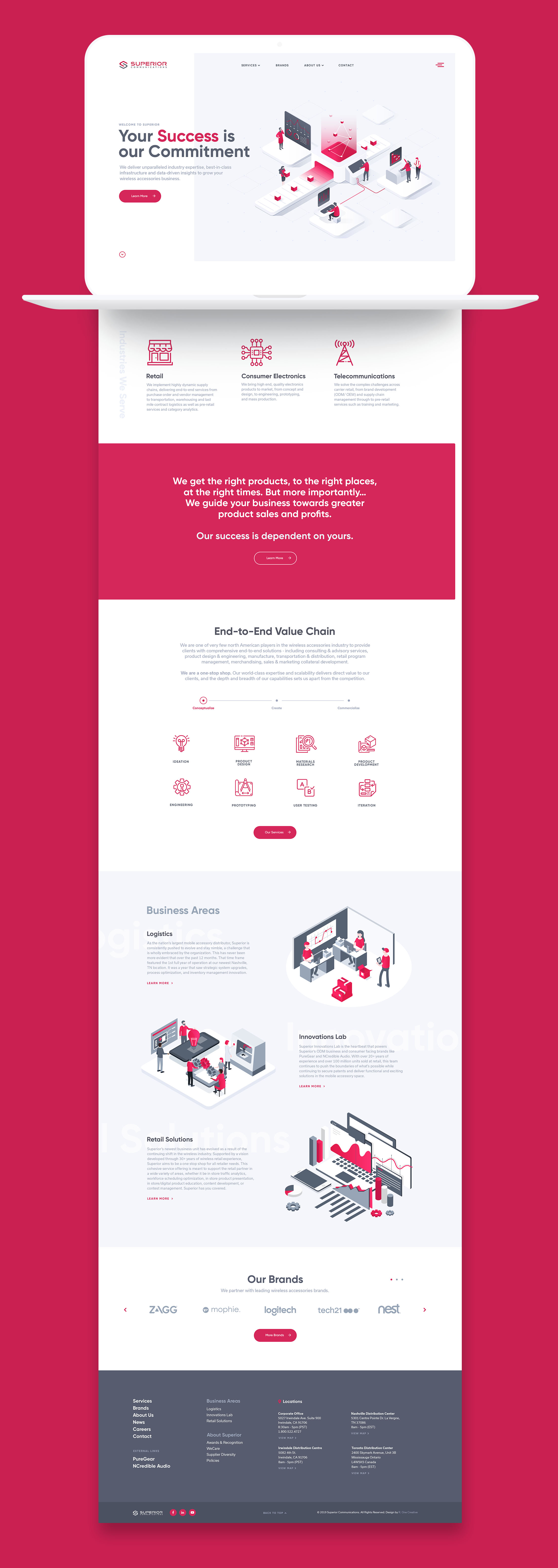
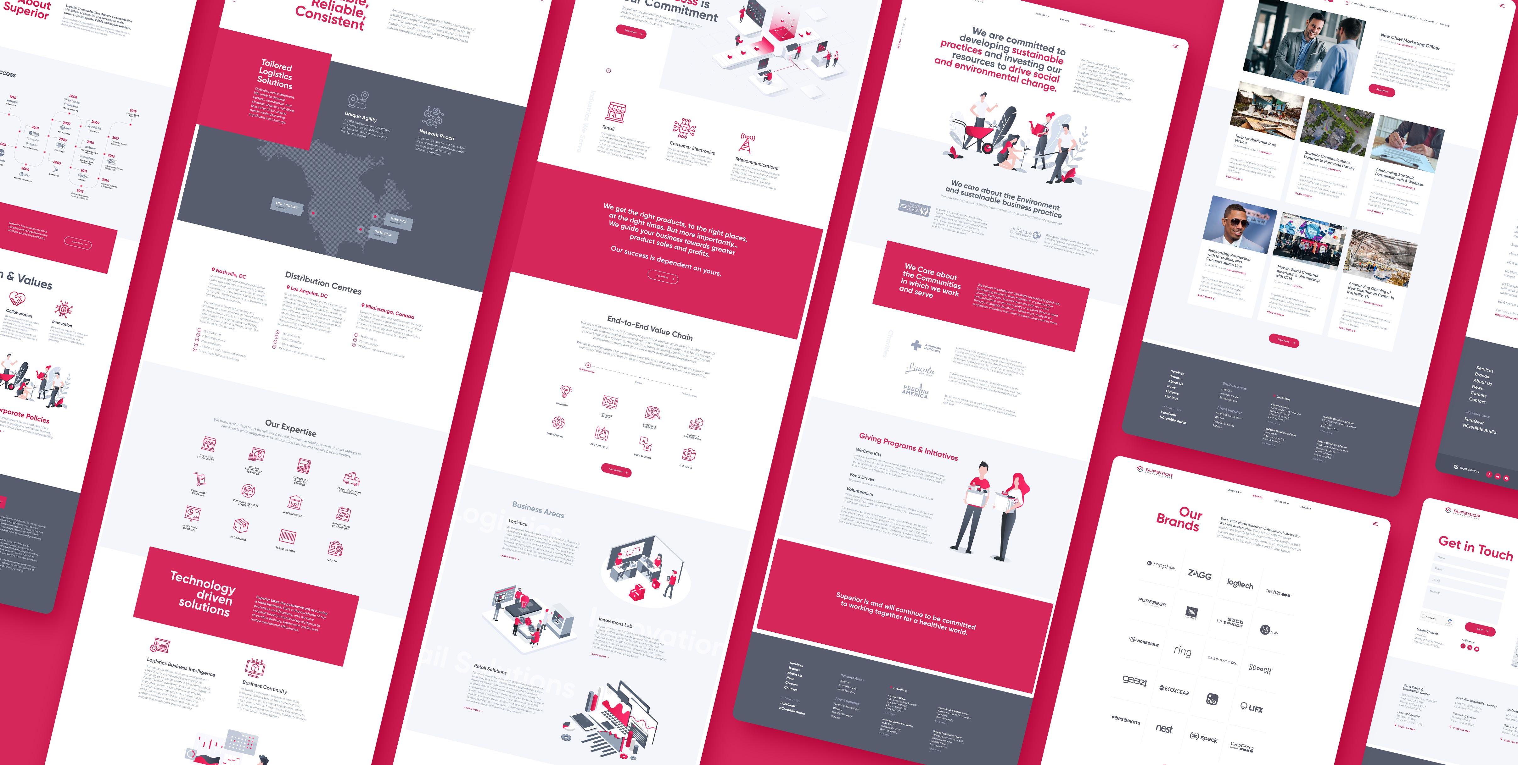
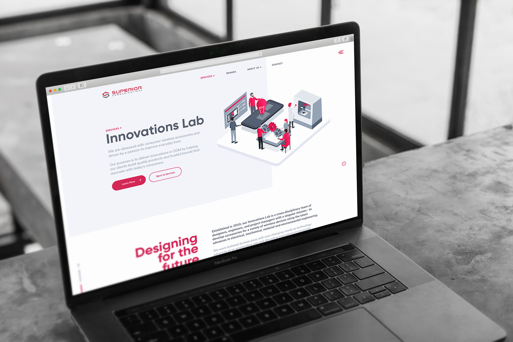
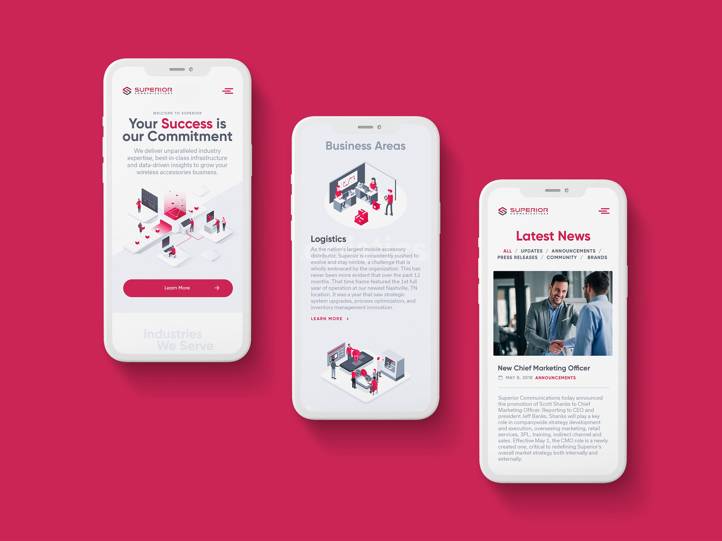
The previous website was difficult to use and lacked relevant information about services and lines of business. Content and positioning on corporate strengths was missing and the design did not represent Superior’s spirit of design innovation. The overall effect was stiff, boring and disengaging.
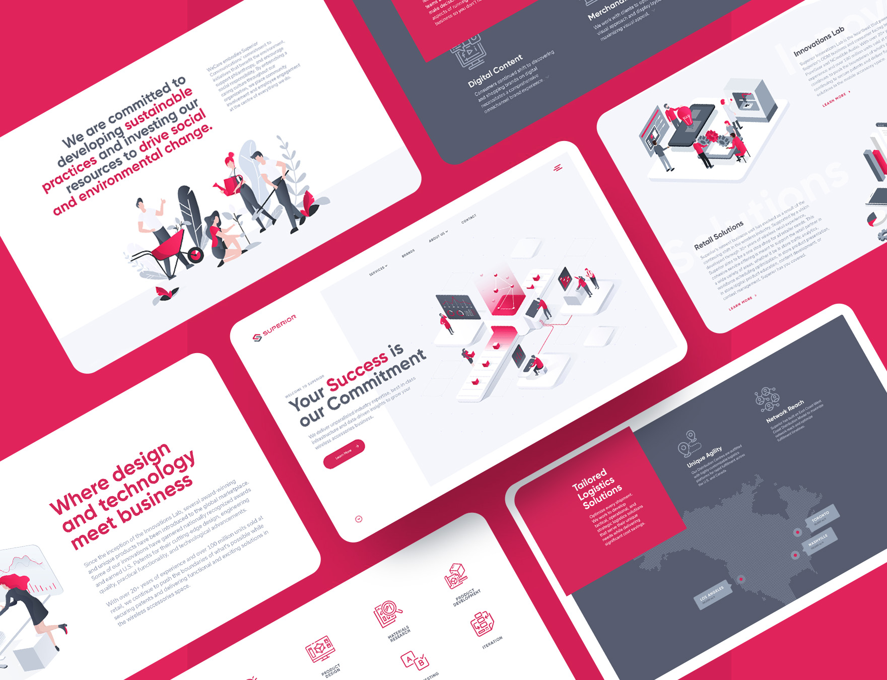
Our website design broke through the dull corporate approach with custom layouts and animations. Intuitive site architecture encourages visitors to click through and learn more about Superior and their exceptional strengths.
A Focus on Content and User Experience
Superior had previously relied on word of mouth referrals and sales presentations to inform their network of their capabilities. Strategic messaging became a core focus of our website redesign. We researched and wrote copy for over 10 detailed website pages to capture the full scope of expertise Superior offers. A clear hierarchical of page structure reflects connections between various departments and lines of business. Content is organized to appeal to various visitor personas through intuitive navigation and page labelling.
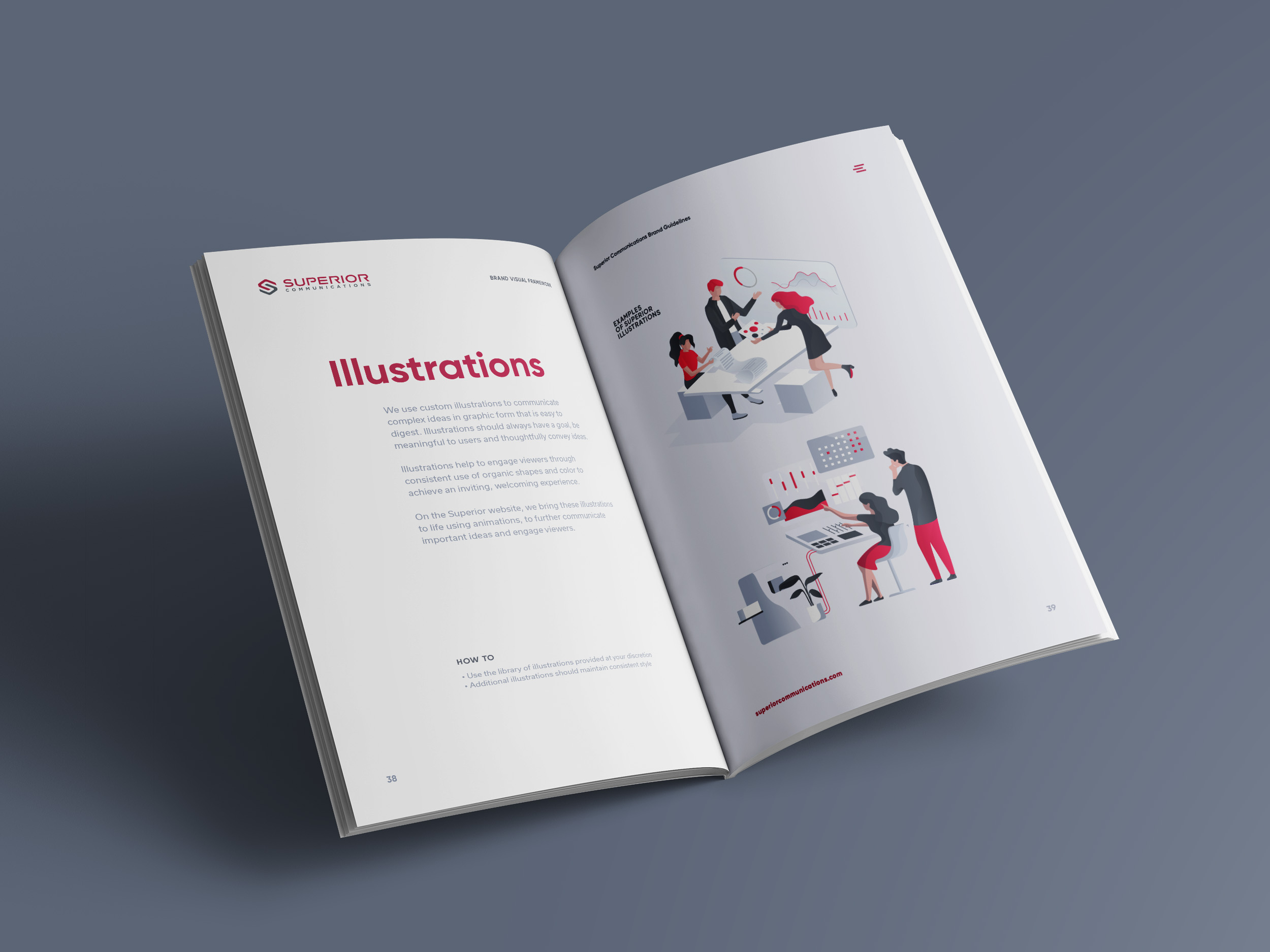
Illustrations are used throughout the website to brighten the content and bring a visual dimension to brand positioning. Animated elements highlight key information and give users a sense of scale and achievement. Superior is an established brand that still has a youthful energy.
Related Projects