Ace Mercado Logo brings Mexican-inspired flavours to Ottawa
Trendy restaurant Ace Mercado needed a logo that echoed the Mexican inspiration found in their creative menu. It needed to have a young, trendy vibe to appeal to Ottawa’s trendy Byward Market crowd.
WHAT WE DID
Logo Design
Drawing Inspiration from
Traditional Mexican Art motifs
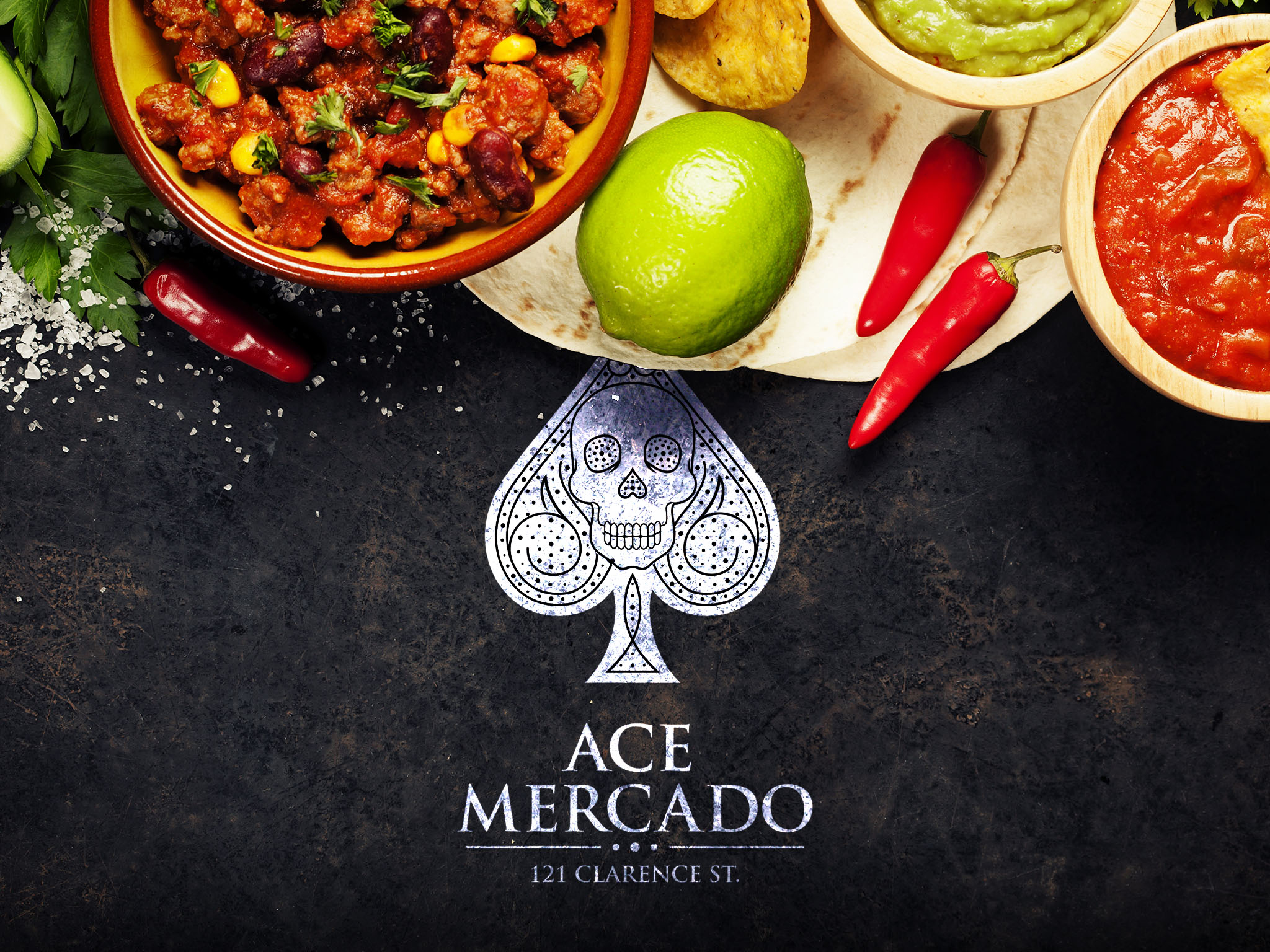
Our design is heavily infused with Mexican flavour, and hits the perfect balance between trendy and iconic. We created a bold geometric spade emblem framing a sugar skull (calaveras de azucar), a tasteful and elegant interpretation of traditional Mexican art motifs. The intricate detailing calls to the custom hand crafted cocktails and creative food menu.
The fine lines and pattern of Ace Mercado’s logo translate beautifully on menus and signage, and reflect its authentic, artisanal vibe.


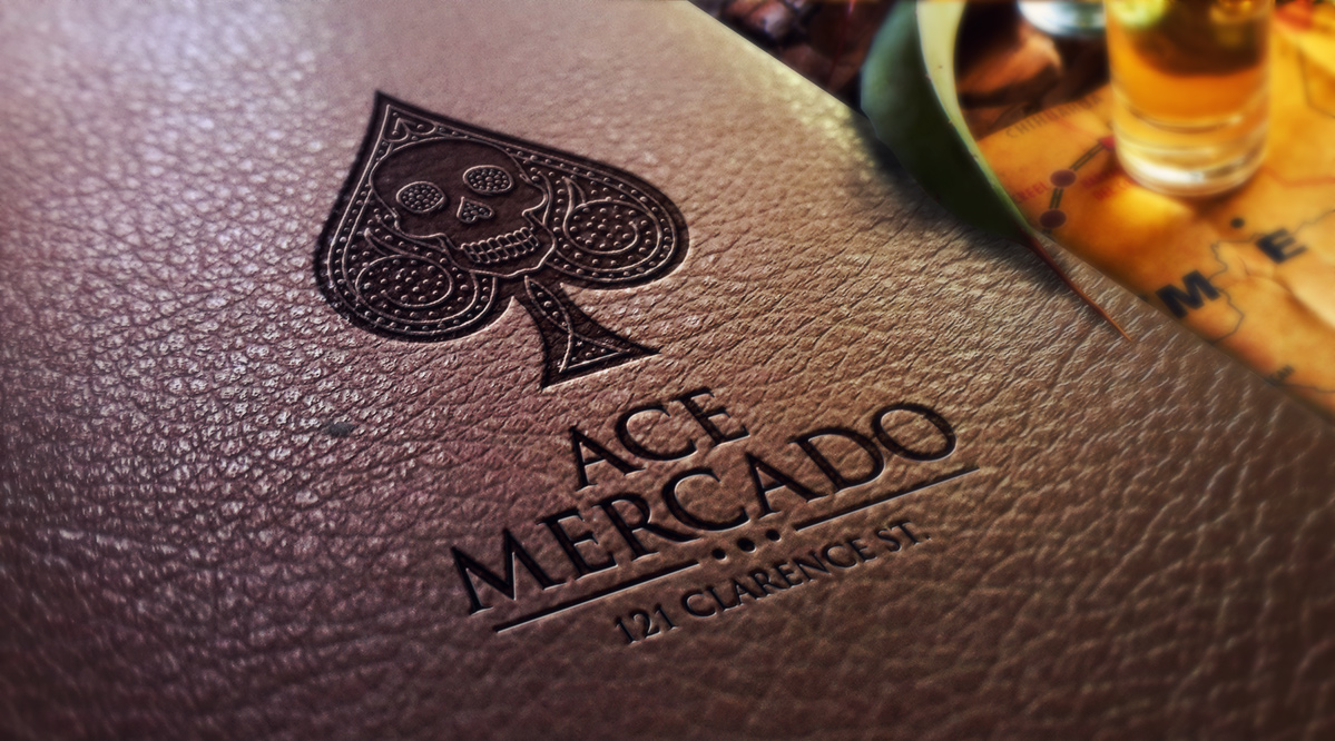
Modern. Rustic. Hipster.
The new design needed to be clean and easy to replicate on different mediums at various sizes; translating seamlessly from flyers and menus to posters, displays and signage.

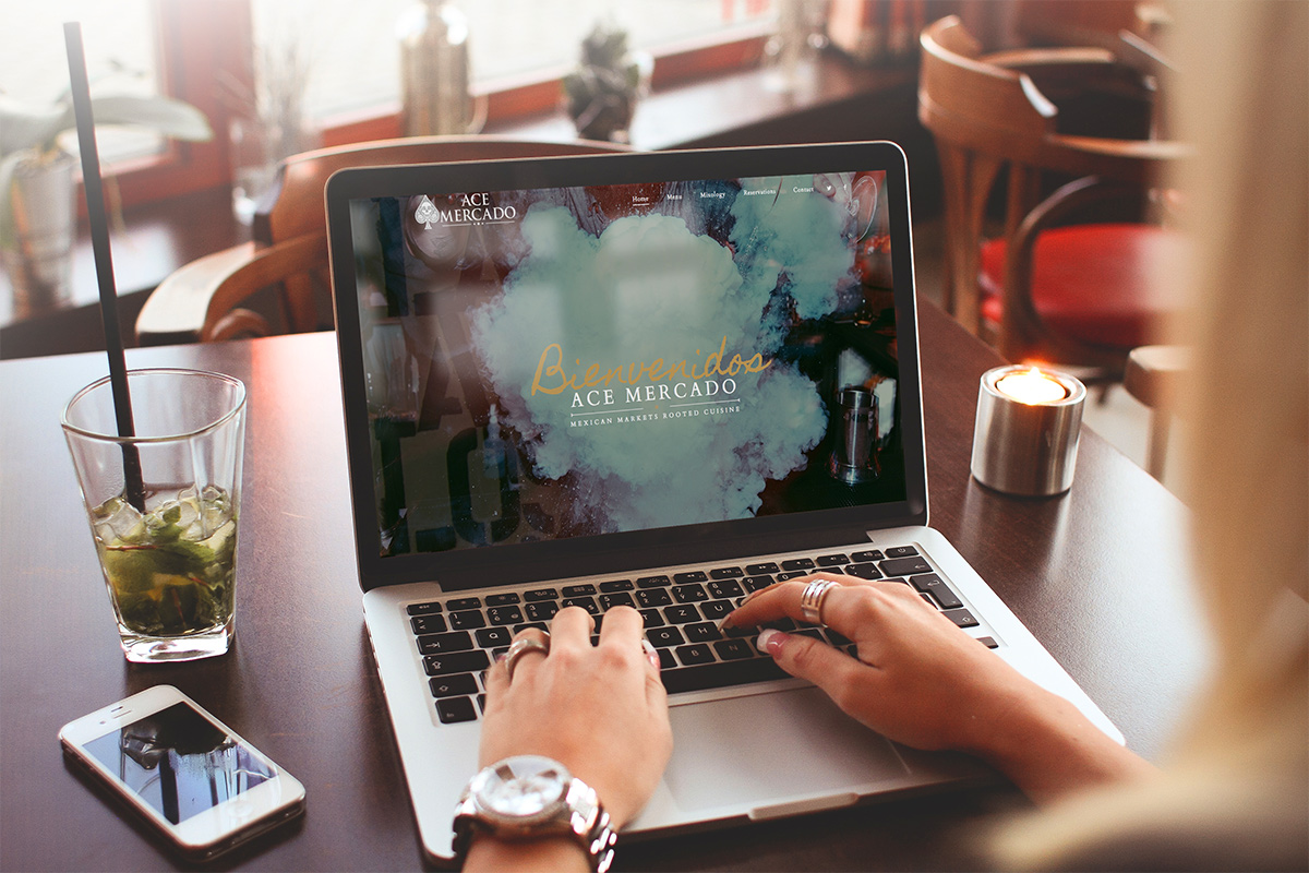
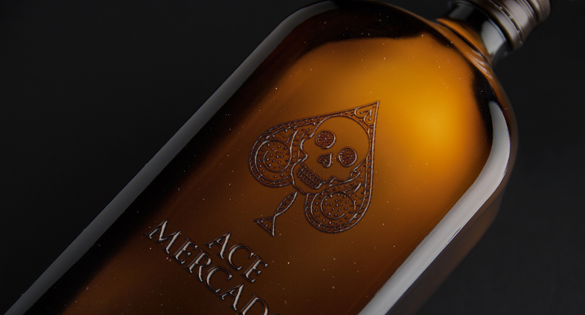
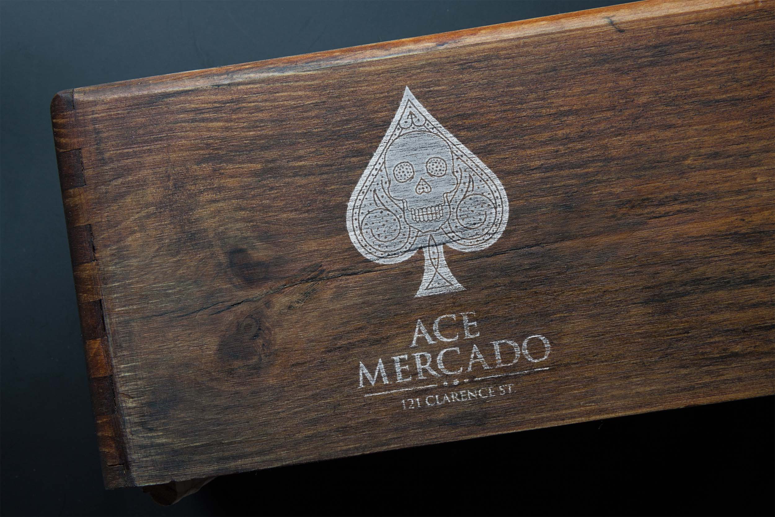
Your restaurant logo is a visual identity that your clientele connect with.
Whether you’re about to open a new restaurant, or revitalize the brand identity of your established restaurant, your restaurant’s logo design should be treated as a critical component of your local marketing strategy.


