Primo is a Turntablist and Rebel Pop Radio resident.
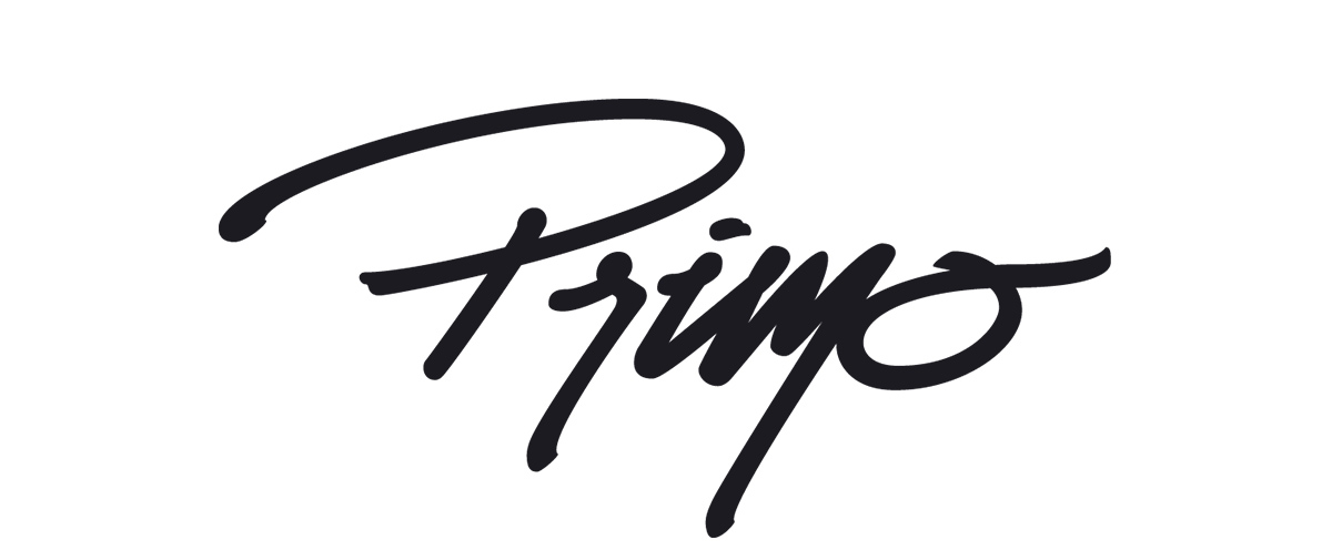
Primo hit us up to redesign his existing logo to better represent the music he puts out. He was looking for a new DJ logo with a handwritten feel drawing on graffiti and marker styles influences. The design needed to look authentic, and stand out from the common fonts found in DJ promotion materials.
WHAT WE DID
Logo Design
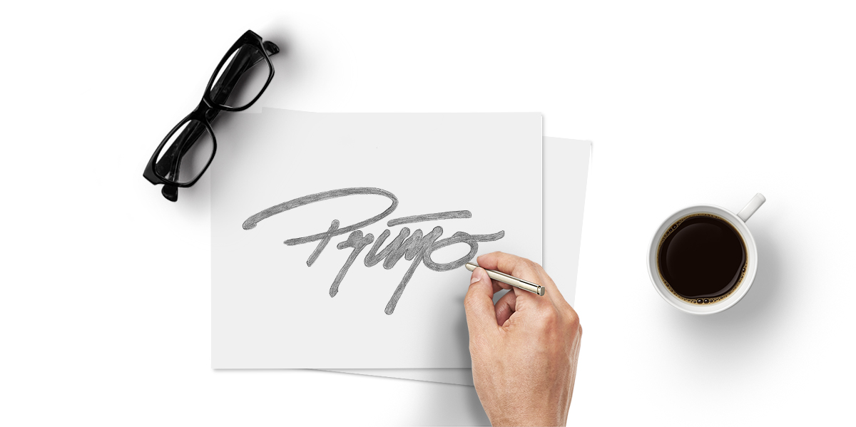
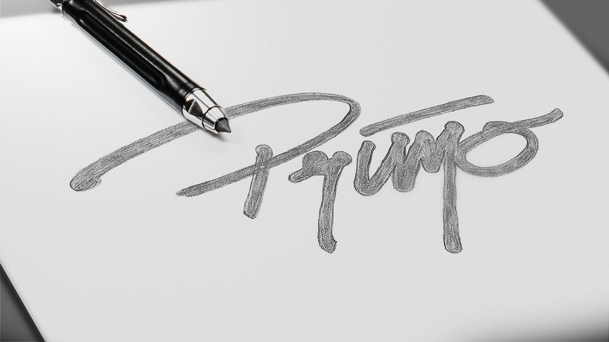
Primo needed a logo that represented him
Ready to move from his existing one, Primo came to us for a design that would better represent the music he puts out. Primo was looking for a handwritten feel, drawing on graffiti and marker styles influences. It needed to look authentic, and stand out from the common fonts found in DJ promotion materials.
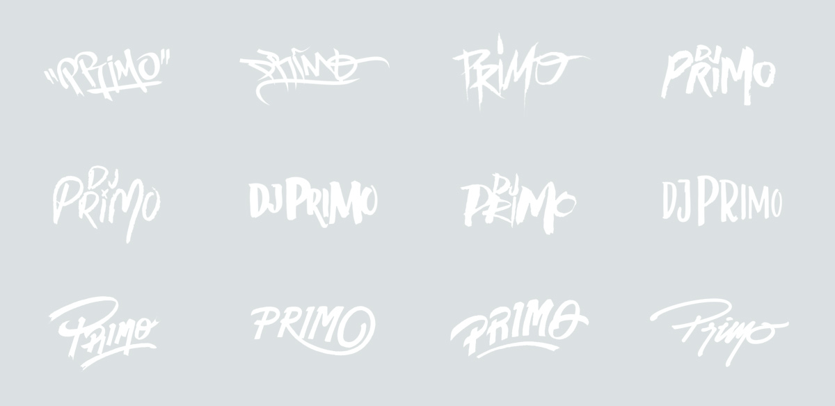
Simple, Bold Strokes
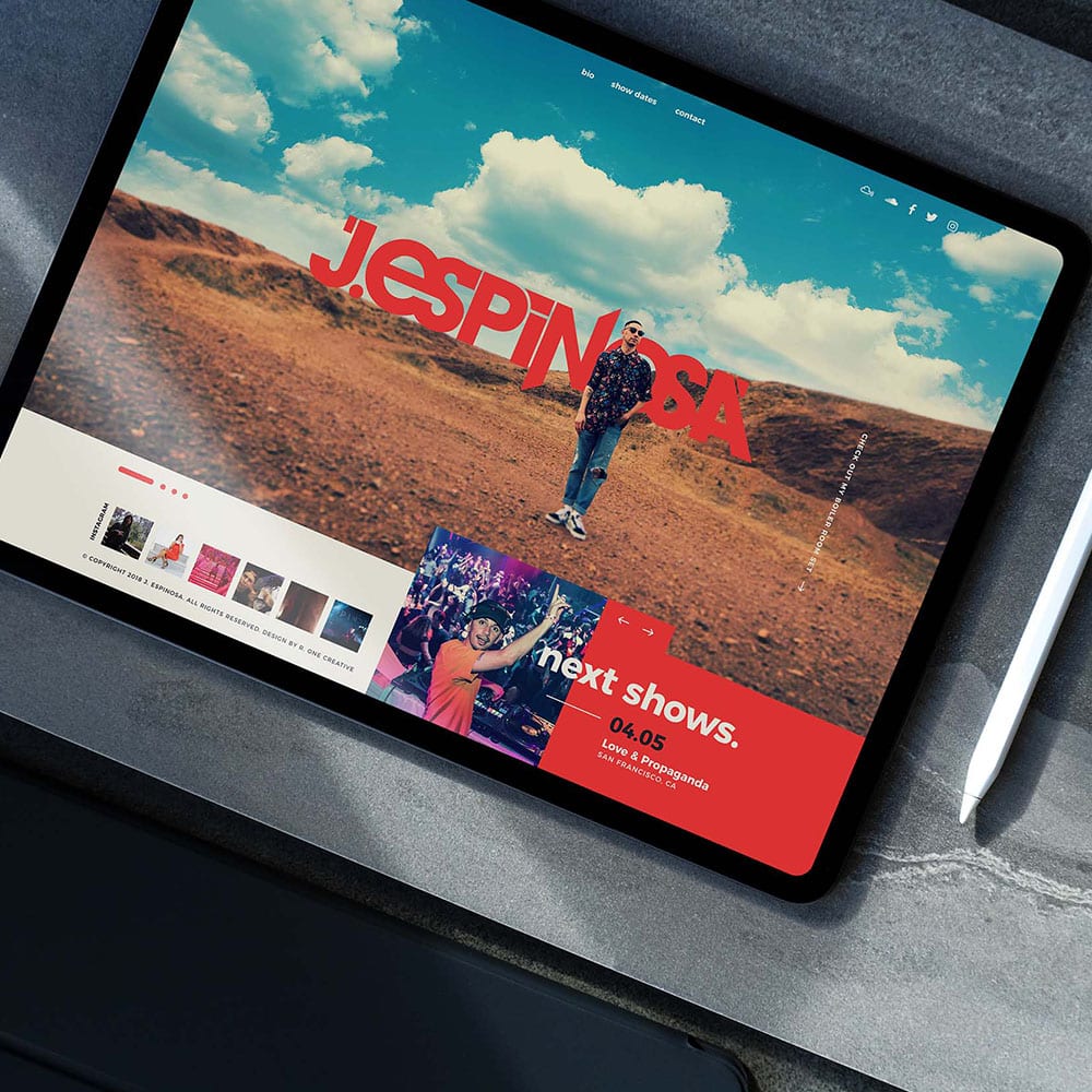
We experimented with a variety of hand lettering styles to find the right confident and authentic, handmade vibe. Our final design has fluid, gestural lines balanced with thick, pronounced brush strokes, instantly giving a personal, handwritten look. The lettering is stylized to have smooth curves, with defined brush stroke detail on the letter stems to feel like the logo was only just painted on.
The result is a brand with depth and personality, distinct from the bold font-based styles we typically see in the industry. Easy to replicate at different sizes, it works on flyers, posters and websites to stickers and more.
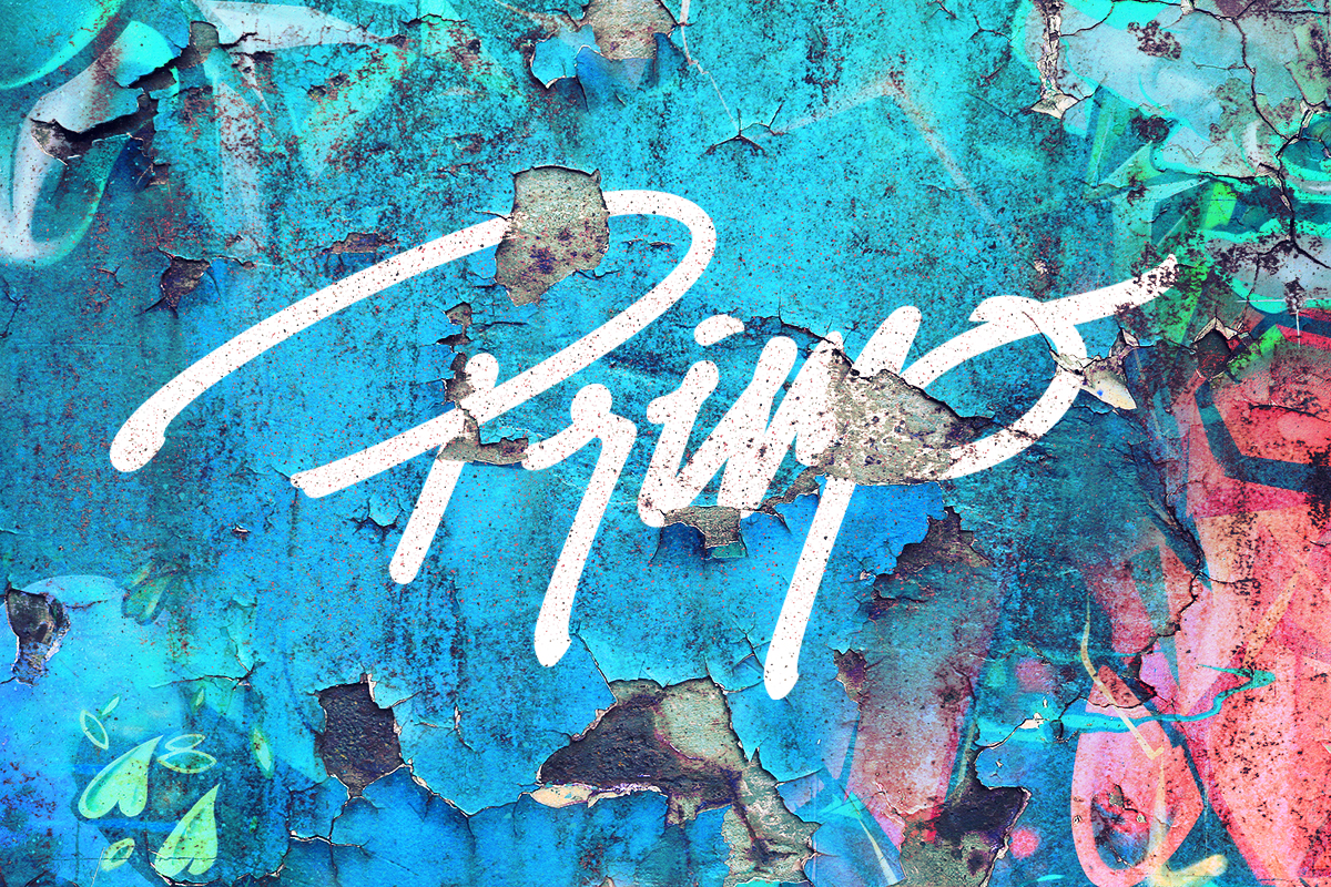
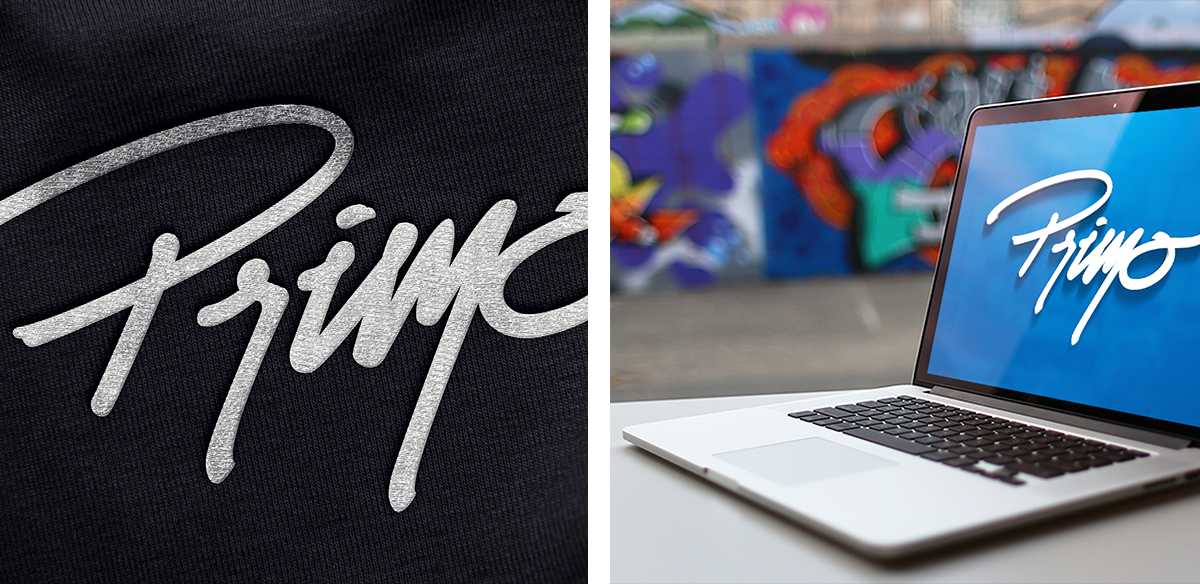
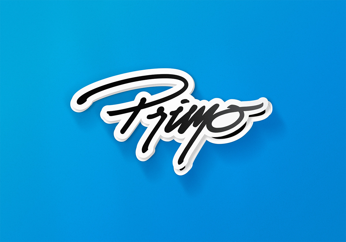
DJ Primo’s logo has a genuine and timeless quality that still looks fresh and interesting since it was first designed. A well-designed logo is critical to getting those bookings and enhancing brand recognition.
Hit us up to get yours.


