Building a scalable marketing strategy for SaaS brands
Shiftlab is a SaaS solution combining team scheduling with workforce optimization for shift-based businesses. Its proprietary algorithms auto-generate shift schedules that optimize employee productivity, manage operational costs and maximize sales performance. Shiftlab is going up against major legacy brands with technology that’s poised to disrupt workforce management. To capture mindshare Shiftlab needed to scale its brand presence and generate leads in a saturated marketplace.
WHAT WE DID
Branding
Custom WordPress Development
Responsive Website Design
Website Copywriting
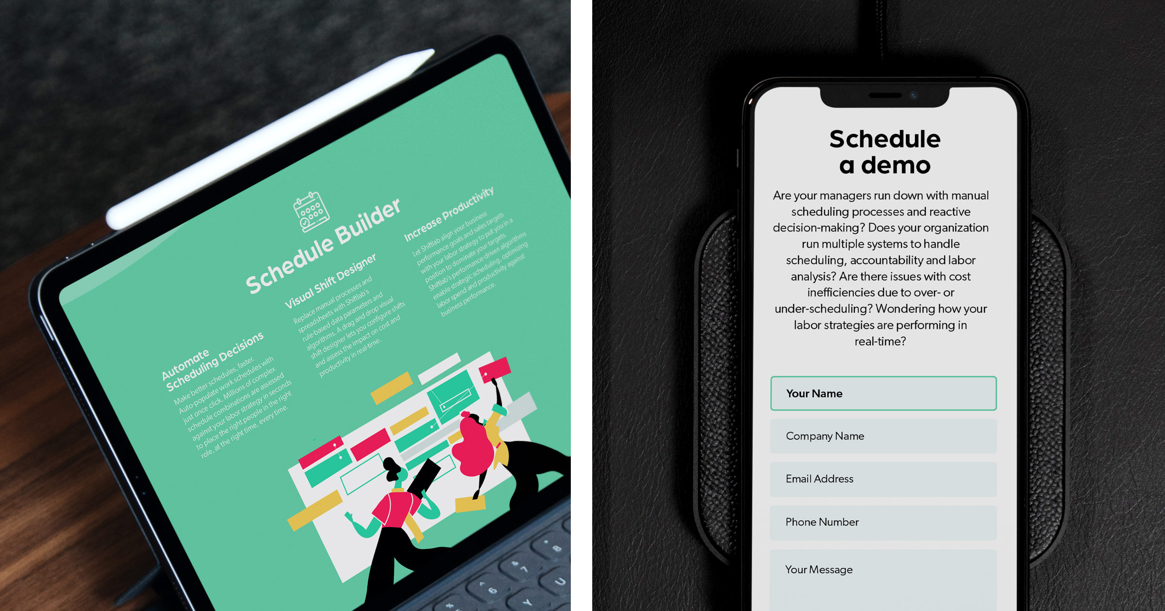
Lead Generation Form
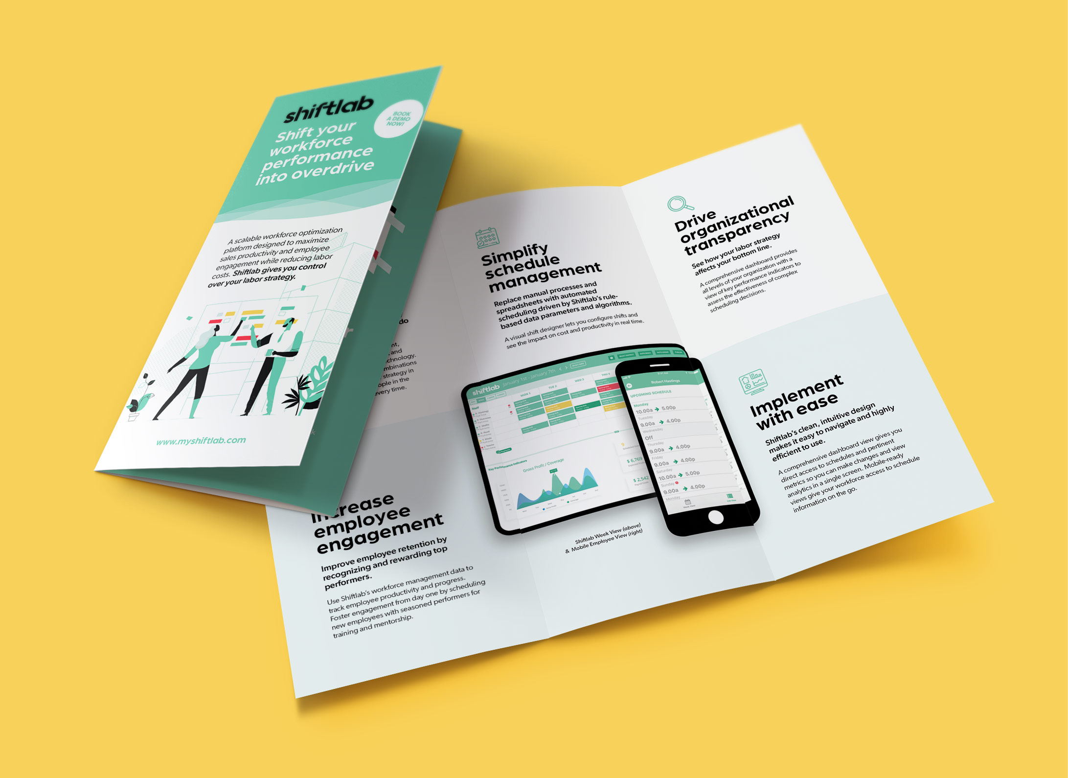
Marketing Brochure
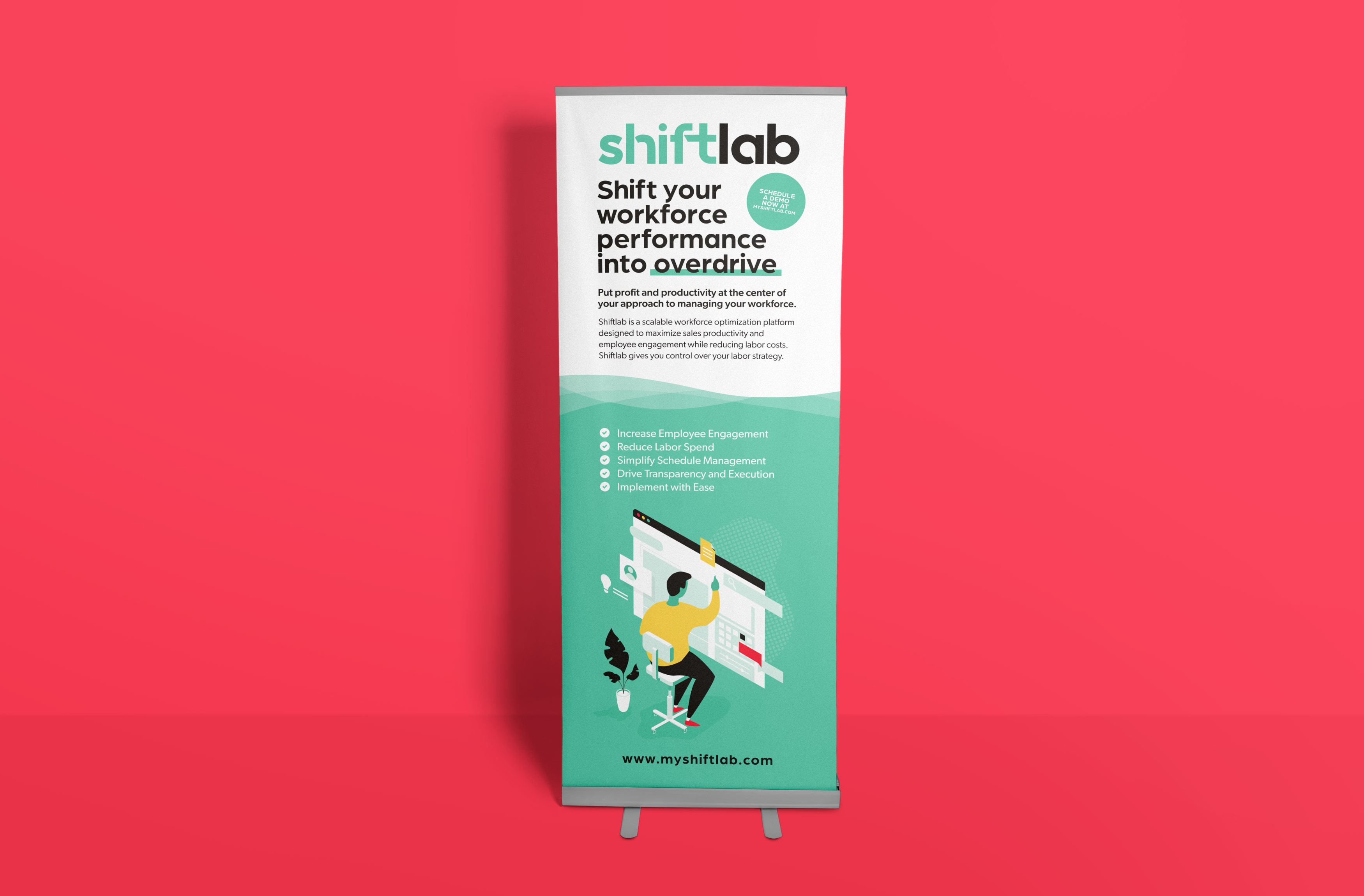
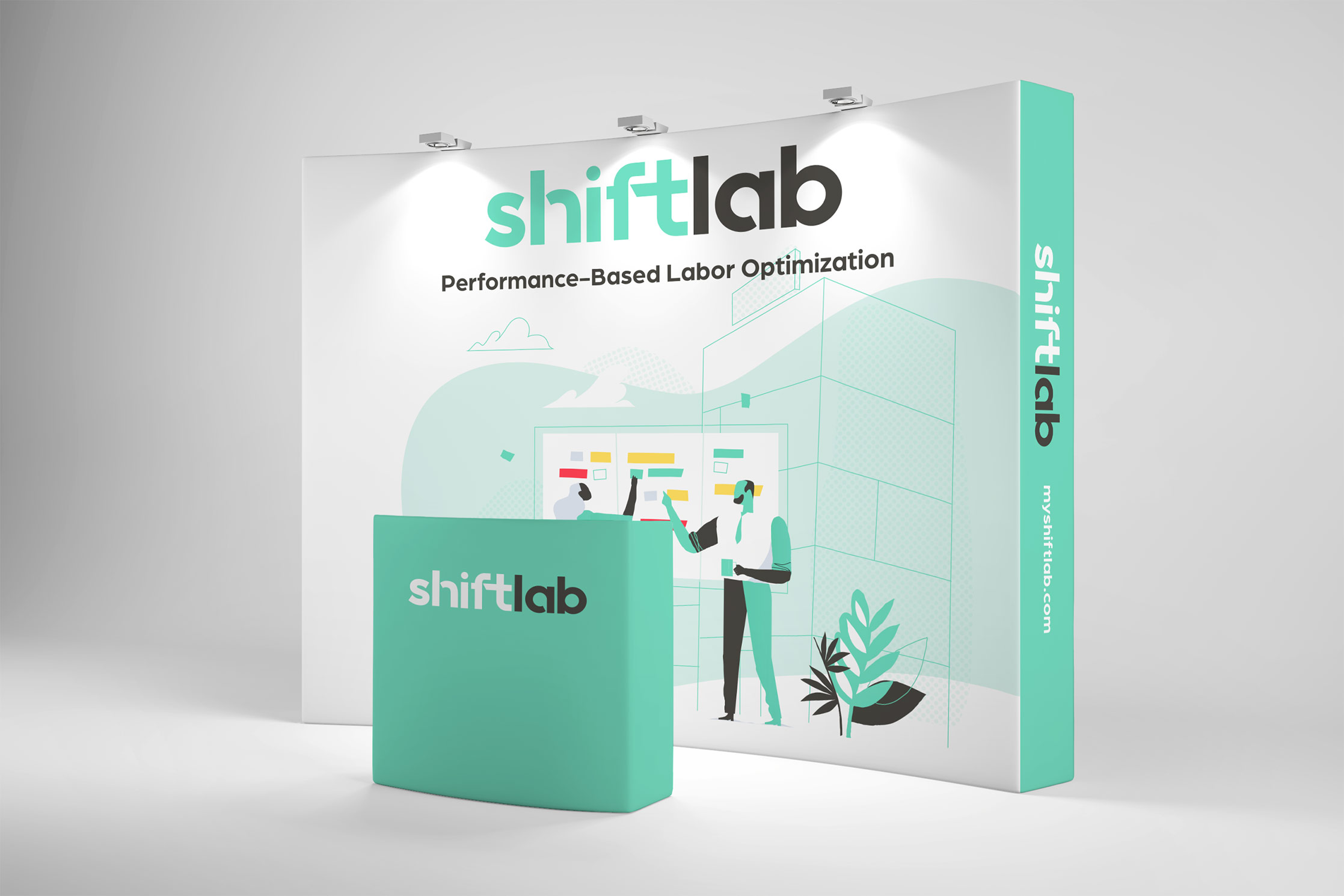
Tradeshow Collateral

Communicating Value
Accelerating improvements in technology have enabled SaaS solutions to become increasingly accessible, viable alternatives to traditional software. According to an IDC study, SaaS will account for roughly 60% of the public cloud spending by 2020. As SaaS is taking over the cloud computing market new startups are launching, vying for subscribers. Market-leading brands have deep pockets and vast resources, allowing them to dominate traditional conversion channels such as PPC. Smart scaling strategies help new SaaS brands target key growth channels for real, sustainable results beyond the startup stage.
Marketing success in this space relies on laying solid strategic foundations for SaaS brands. Prospects mostly research and buy subscription services online. This makes it necessary to have a strong, well-thought-out brand identity and conversion-optimized website. We enhanced Shiftlab’s brand presence and developed quality trade show collateral targeting enterprise customers. Shiftlab’s new website puts forward a standout brand presence that builds trust and motivates leads for demo requests.
SaaS Branding
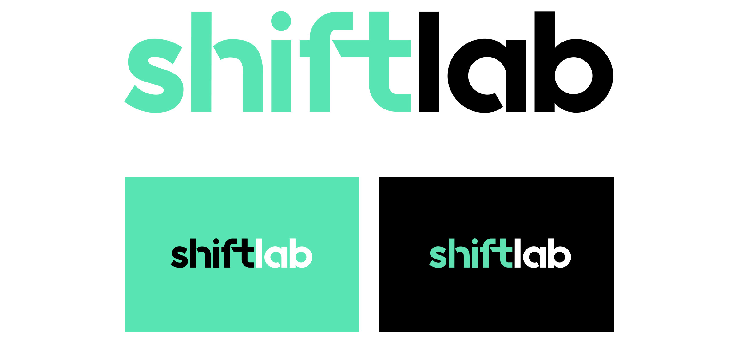
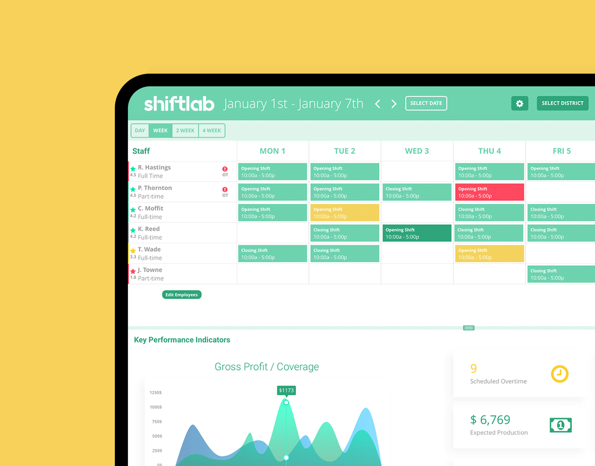
Shiftlab’s core feature is a visually optimized dashboard. We worked with the dashboard’s design queues to develop a cohesive visual brand identity across the software and website. The final wordmark is clean, minimal and timeless. It scales easily on different media and is designed to be compatible and fast loading across platforms. The bold typeface is modern and the lowercase lettering evokes an open and friendly feeling. Stylized details add interest and a sense of customization.
Using color and typography to tell a story
Studies show color makes a big impression on SaaS prospects and conversion rates. The palette is inspired by Shiftlab’s dashboard design, with accent colors that create interest and add movement.
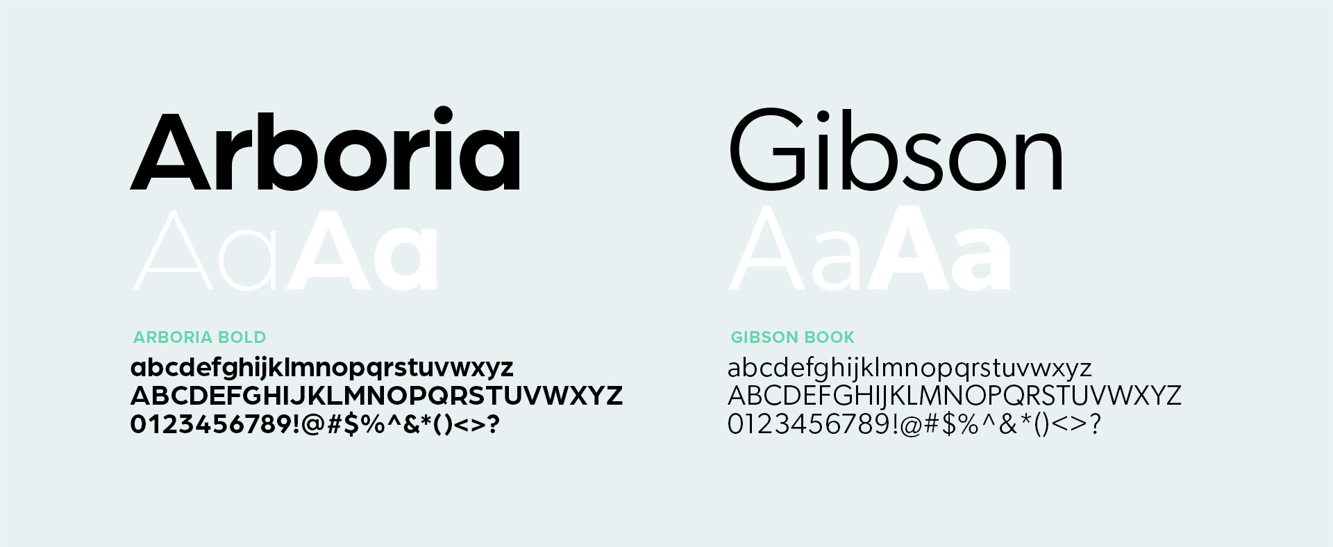
To successfully convert more visitors into subscribers, website messaging must be easy to scan and understand. A well-crafted font hierarchy considers font weight and size and implements a consistent messaging structure that increases reader comprehension. Purposeful negative space creates breathing room between key messages, making the web page copy easy to glance over and digest.

SaaS Website Design
When considering SaaS brands, potential customers regard the website as an indicator of the quality and usability of the application itself. This makes a SaaS website a worthy and critical investment.
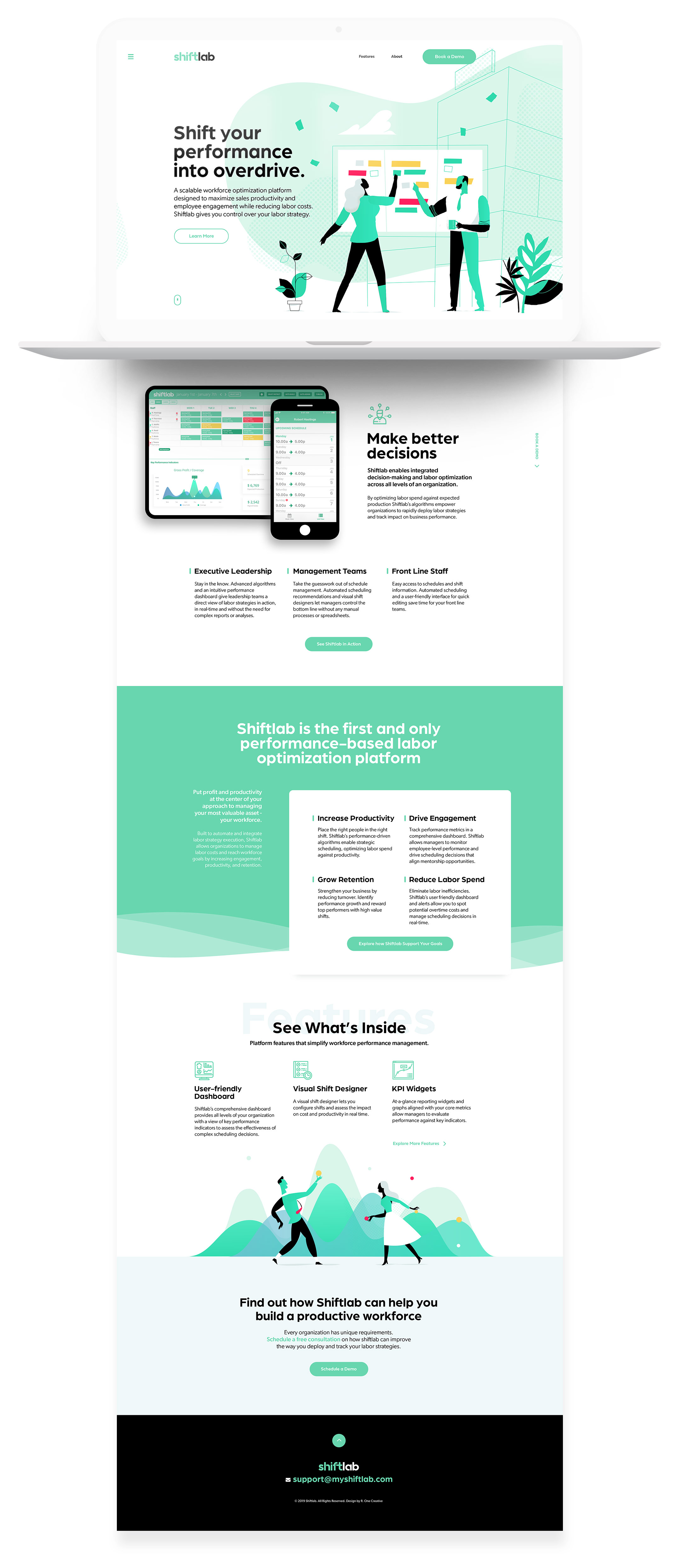
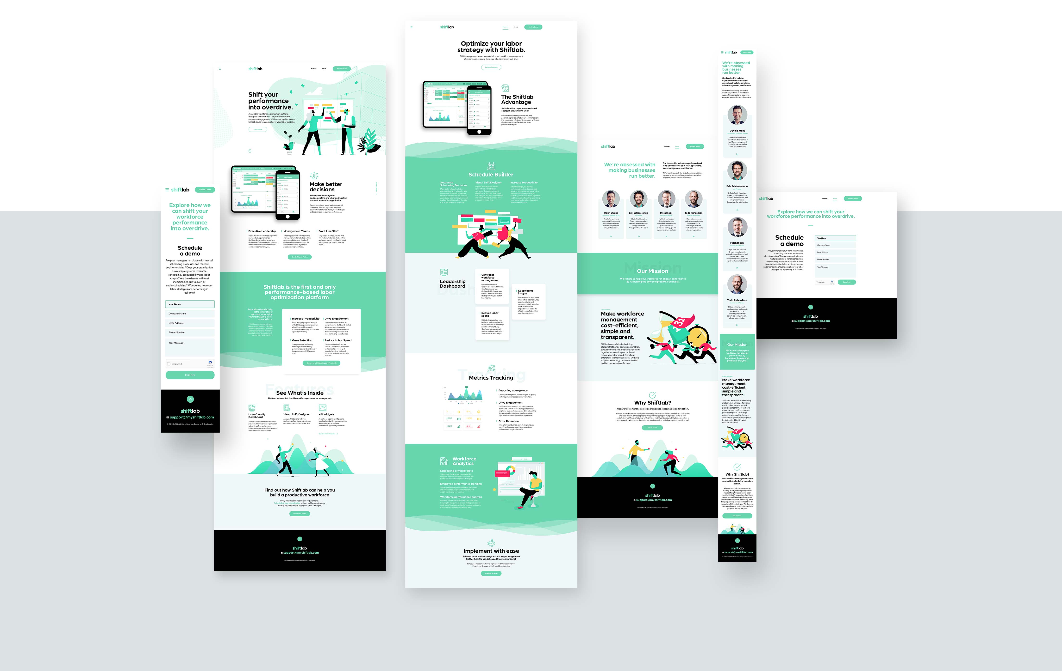
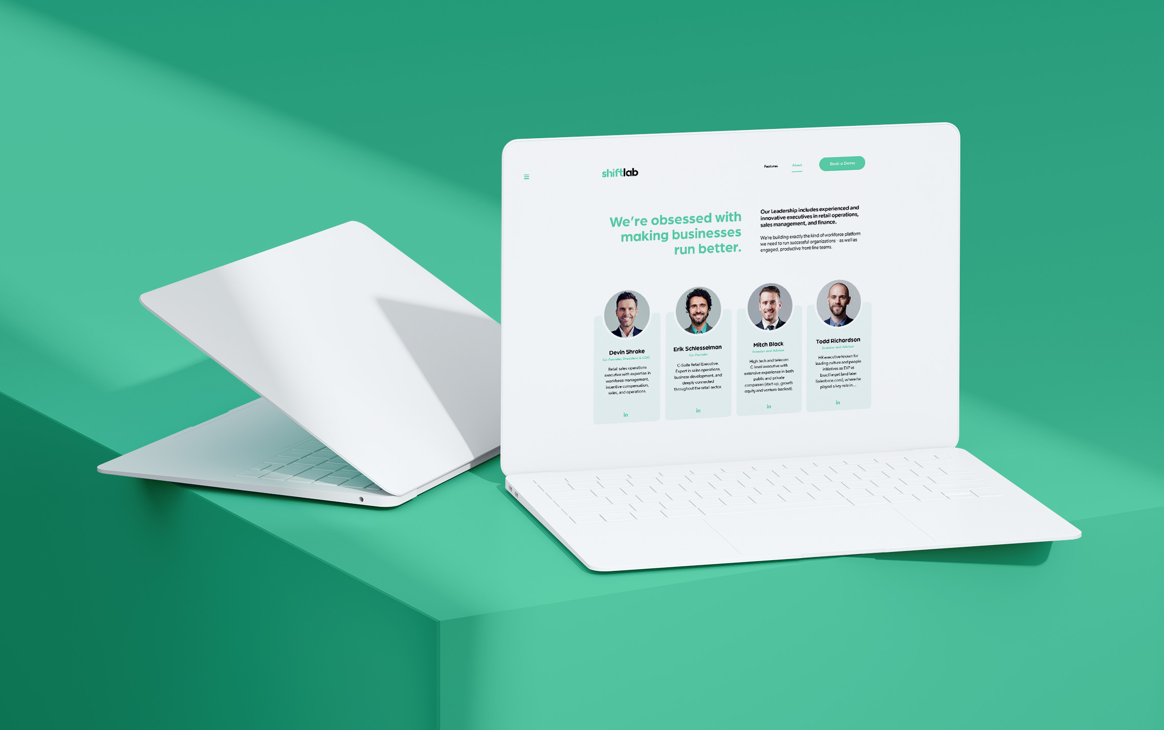
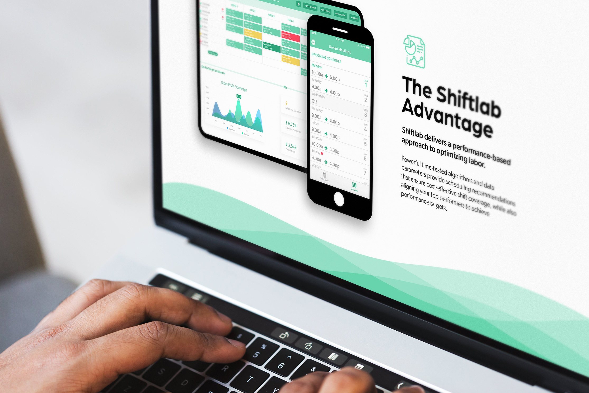
Thoughtful UI design builds trust. The minimalist design, intentional use of negative space and flat illustrations make the website modern, interactive and user-friendly. An expressive visual hierarchy arranges messaging in an intuitive manner. Aesthetically pleasing wireframes showcase a combination of Shiftlab mockups that hint at the application while drawing attention to key features like the dashboard. Contrasting light and dark layout elements are pleasing to the eye, directing attention to key messaging.
Branded Illustrations
Custom illustrations convey complex messages in a single visual, while further building on brand recognition and trust. Warm, whimsical characters bring the brand to life. Brand accent colors are used in a purposeful way to move the visitor’s eye across the page.


Engaging icons
Icons are an effective way to convey complex ideas visually without using words. A custom icon library was developed to highlight important information, and animate on page load. The designs are scannable and appealing, allowing visitors to quickly understand Shiftlab’s main features.
Responsive, mobile
friendly design
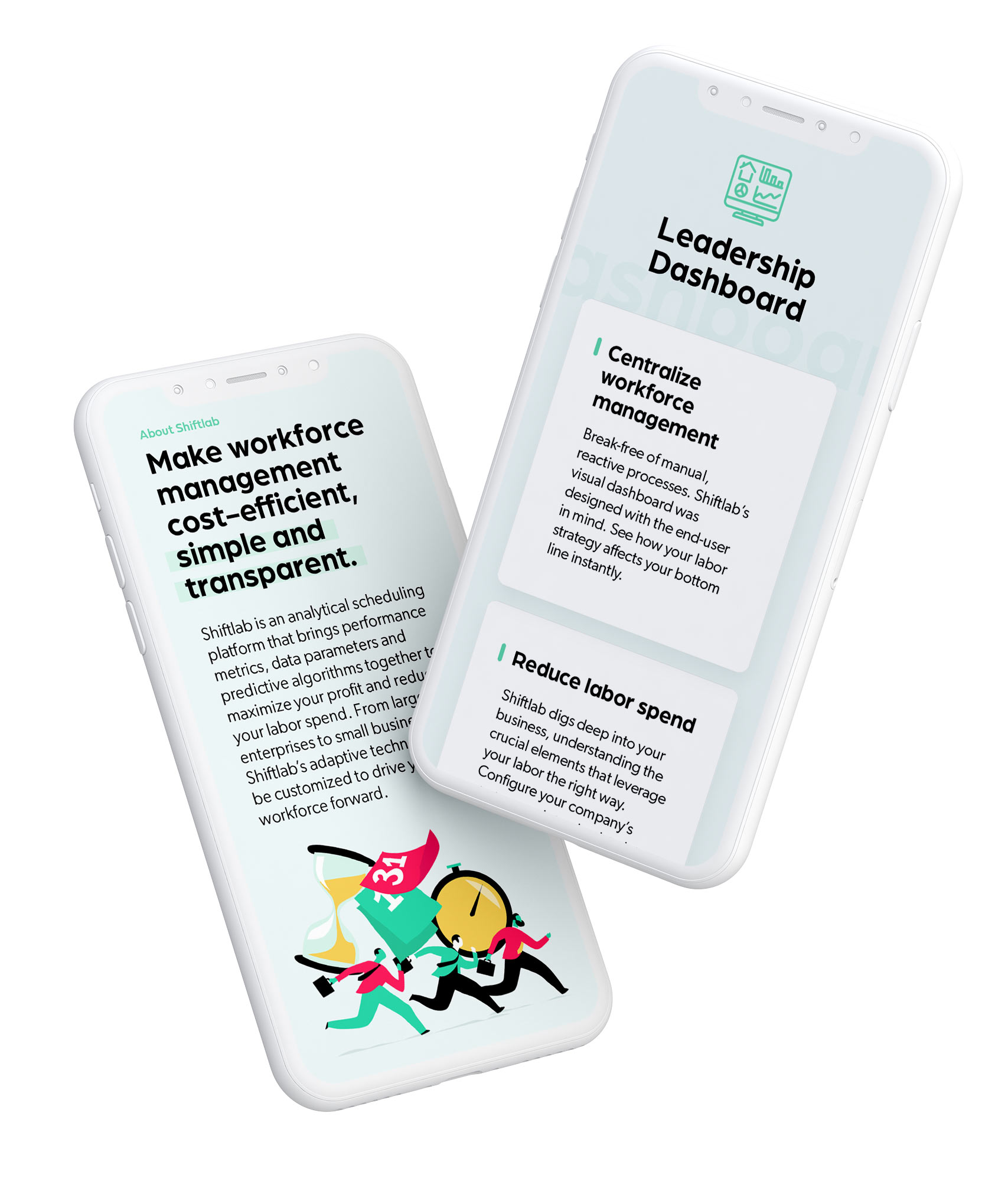
More than half of online traffic is generated through mobile phones. Since responsive websites are now a design standard, Shiftlab’s website is optimized for mobile viewing across different screen sizes.

Quality Content
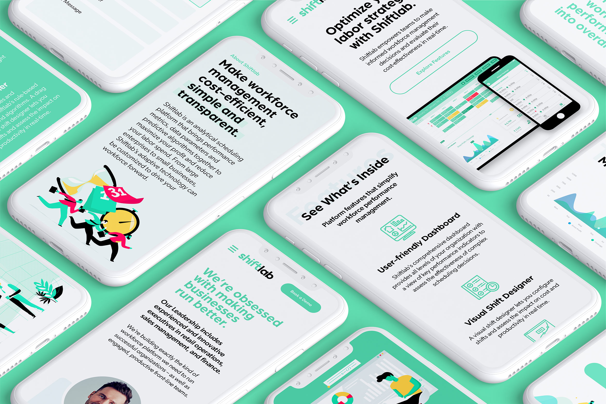
Engaging headlines and concise benefit-centric copy gives visitors a clear understanding of Shiftlab’s value proposition. A simple main menu focuses the reader, providing direct links to “sign up” to schedule a demo. Messaging appeals directly to user needs, positioning value and competitive advantages up front.
Trade show collateral that builds brand confidence
Any solid SaaS scaling strategy should involve outbound marketing at Trade shows. Frontline access to target customers is a high-value opportunity, however making a brand stand out is a challenging task. Exhibitors are competing to attract visitors, generate traction and ultimately close deals. Quality collateral like brochures, pamphlets, and booth signage is a brand’s best advantage to grab attention.
