Blog

Rebranding Peerless Machine & Tool Corporation for the Modern Era
For over 95 years, Peerless Machine & Tool Corporation has quietly led the way in OEM industrial press manufacturing for the global paper and packaging industry. Recently transitioning to employee ownership, Peerless needed a fresh new brand identity that reflects its world-class capabilities, deep-rooted values, and forward momentum. Here’s how we helped them bring it all into focus.
WHAT WE DID
Logo Design & Branding
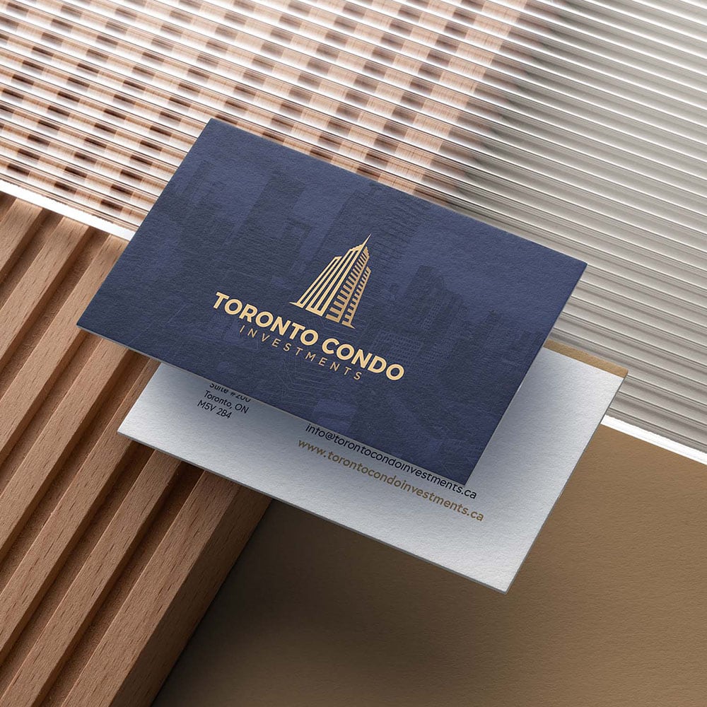
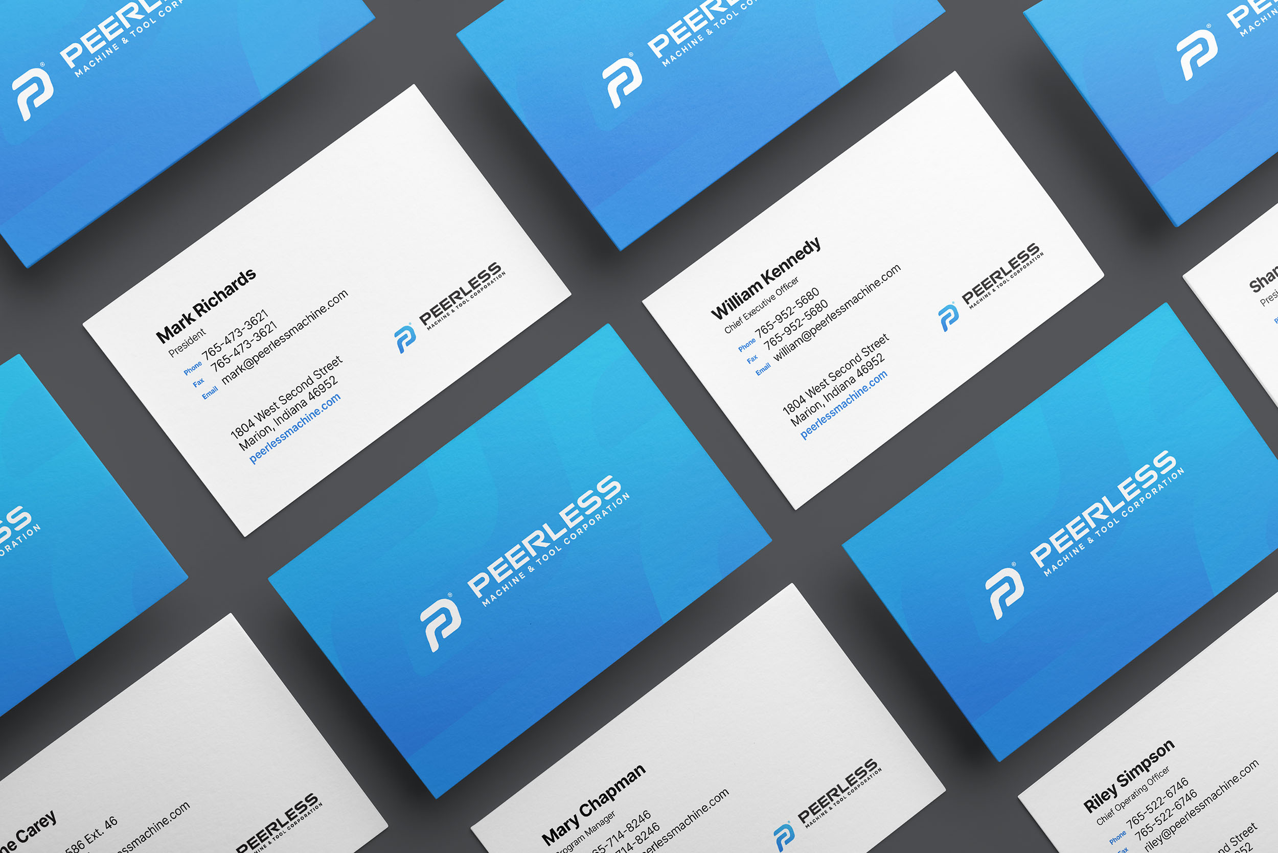
Business Cards
Corporate Brochure
Tradeshow Brochures
Corporation Logo Design & Branding
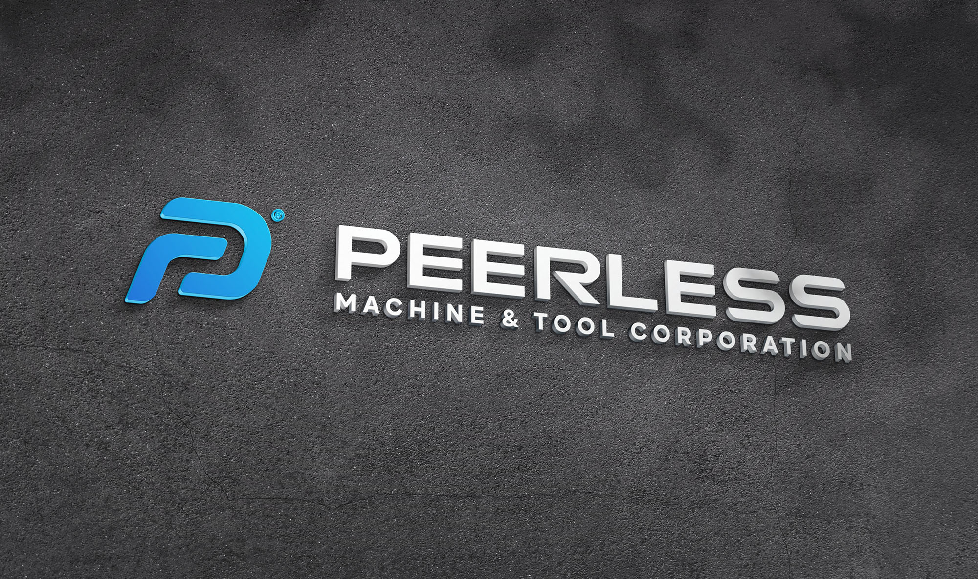
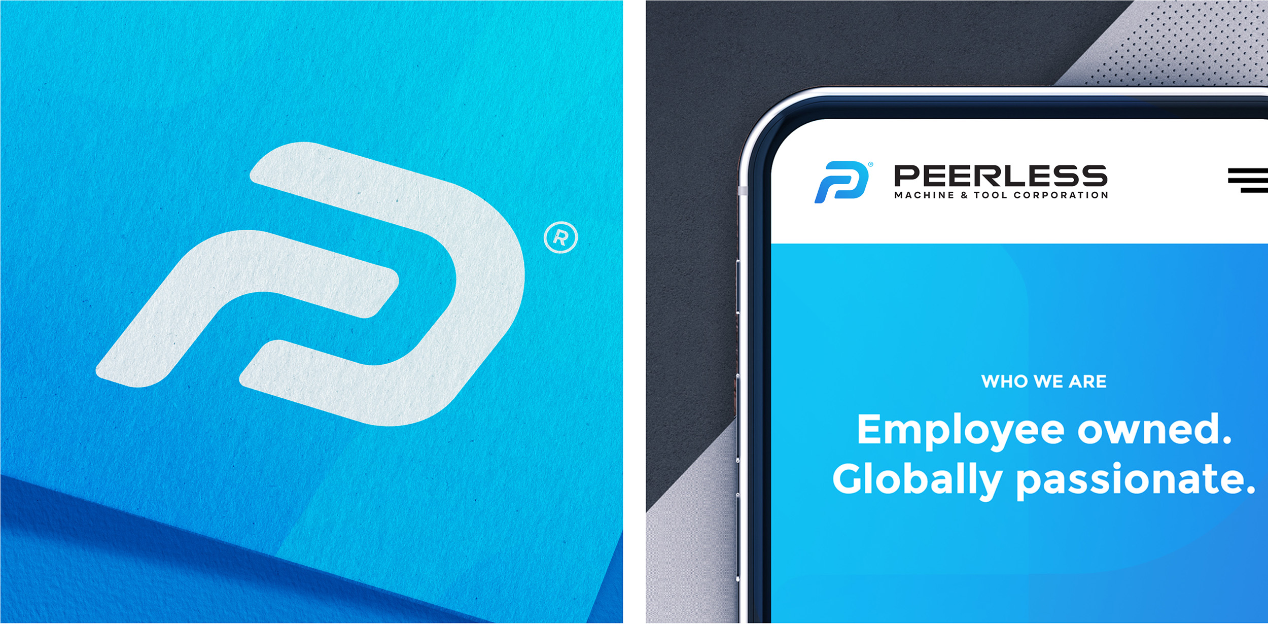
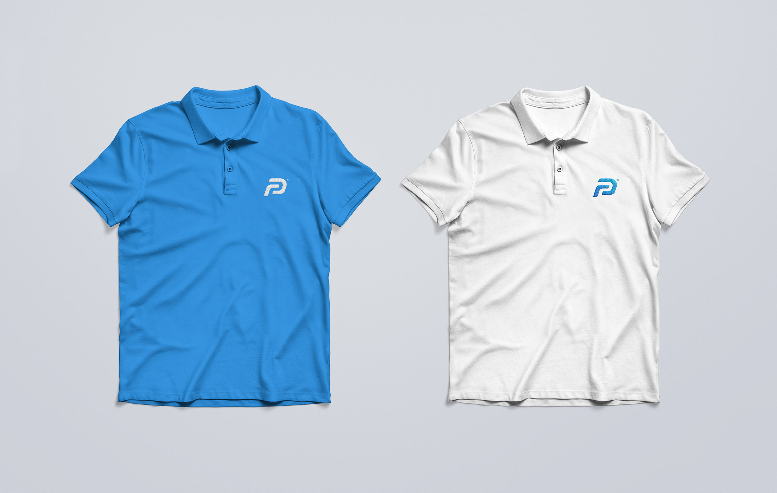
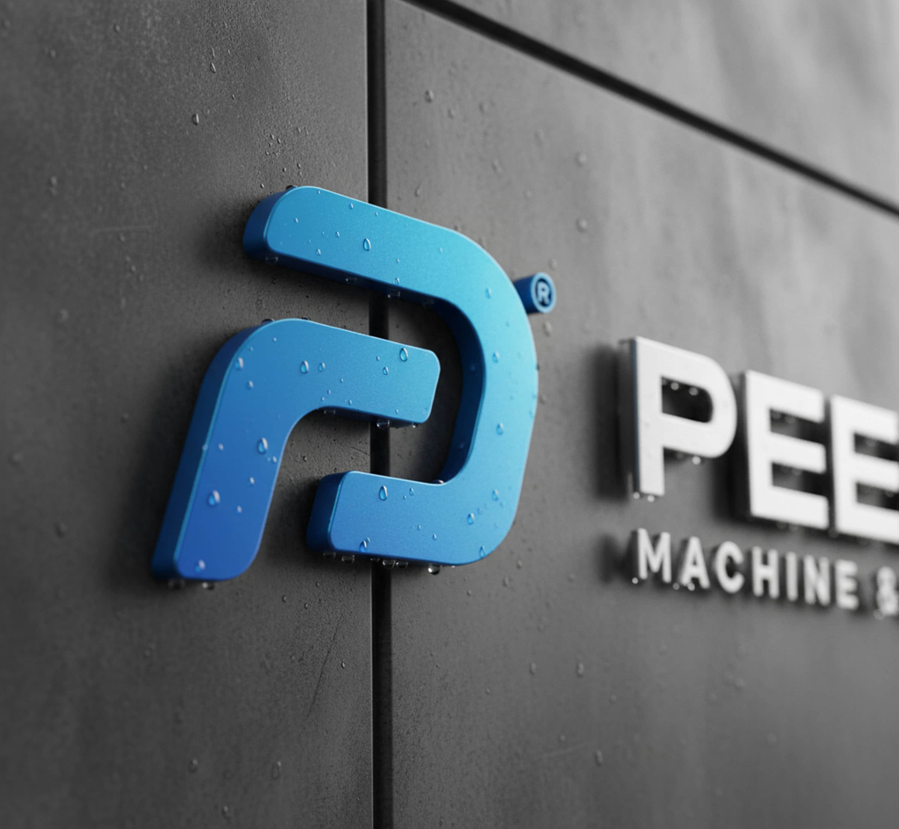
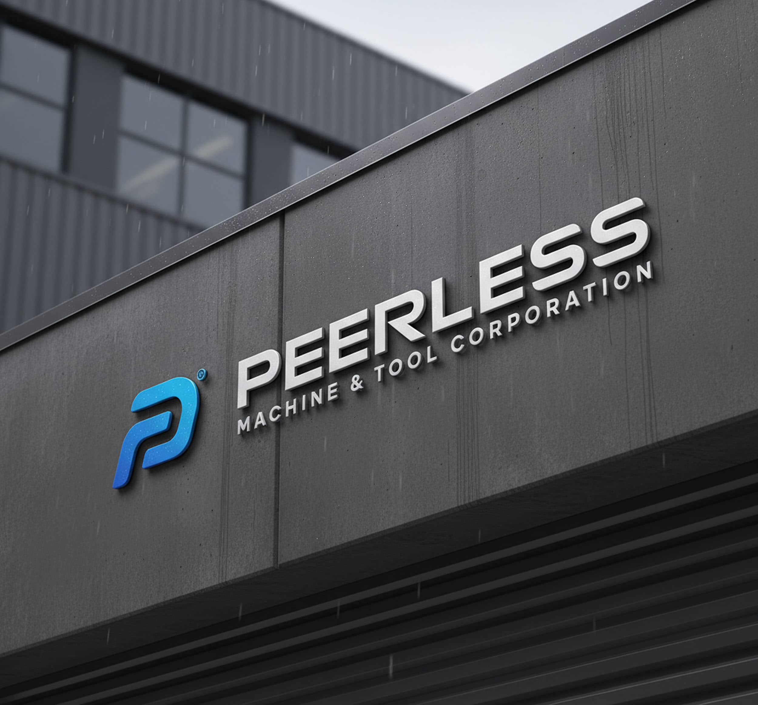
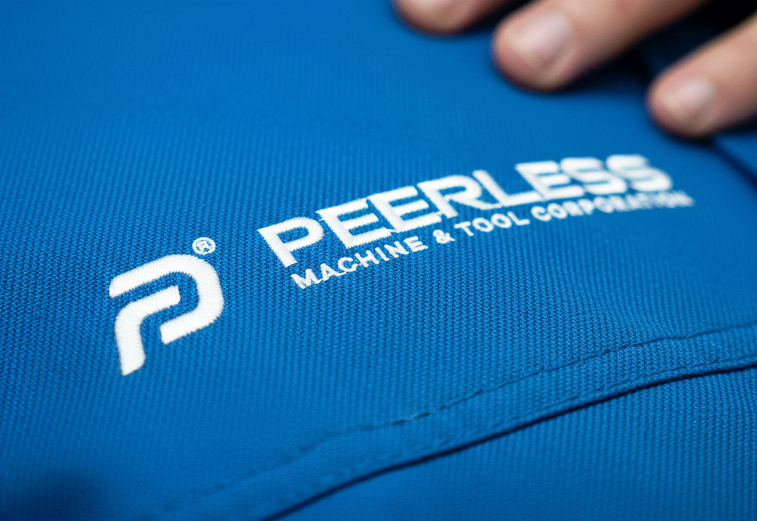
Peerless approached us looking to modernize a proud manufacturing legacy without losing the equity they’ve earned for precision and reliability. Working closely with their leadership, we distilled that brief into a crisp, future-ready identity anchored by a dynamic “P” monogram. The mark traces the smooth contour of a machined path, with internal geometry that suggests motion, throughput, and engineering accuracy. A custom, industrial wordmark balances that energy—geometric and confident, with softened corners that echo milled edges and convey approachability.
Color does the rest of the storytelling: a high-contrast wordmark for strength and longevity, paired with a progressive blue gradient that signals innovation and trust. The system is built to work hard—whether laser-etched on tooling, embroidered on workwear, or rendered as a tiny favicon, the logo maintains clarity in both full-color and one-color applications—giving Peerless a distinct, scalable mark that feels as exacting as the machines behind it.
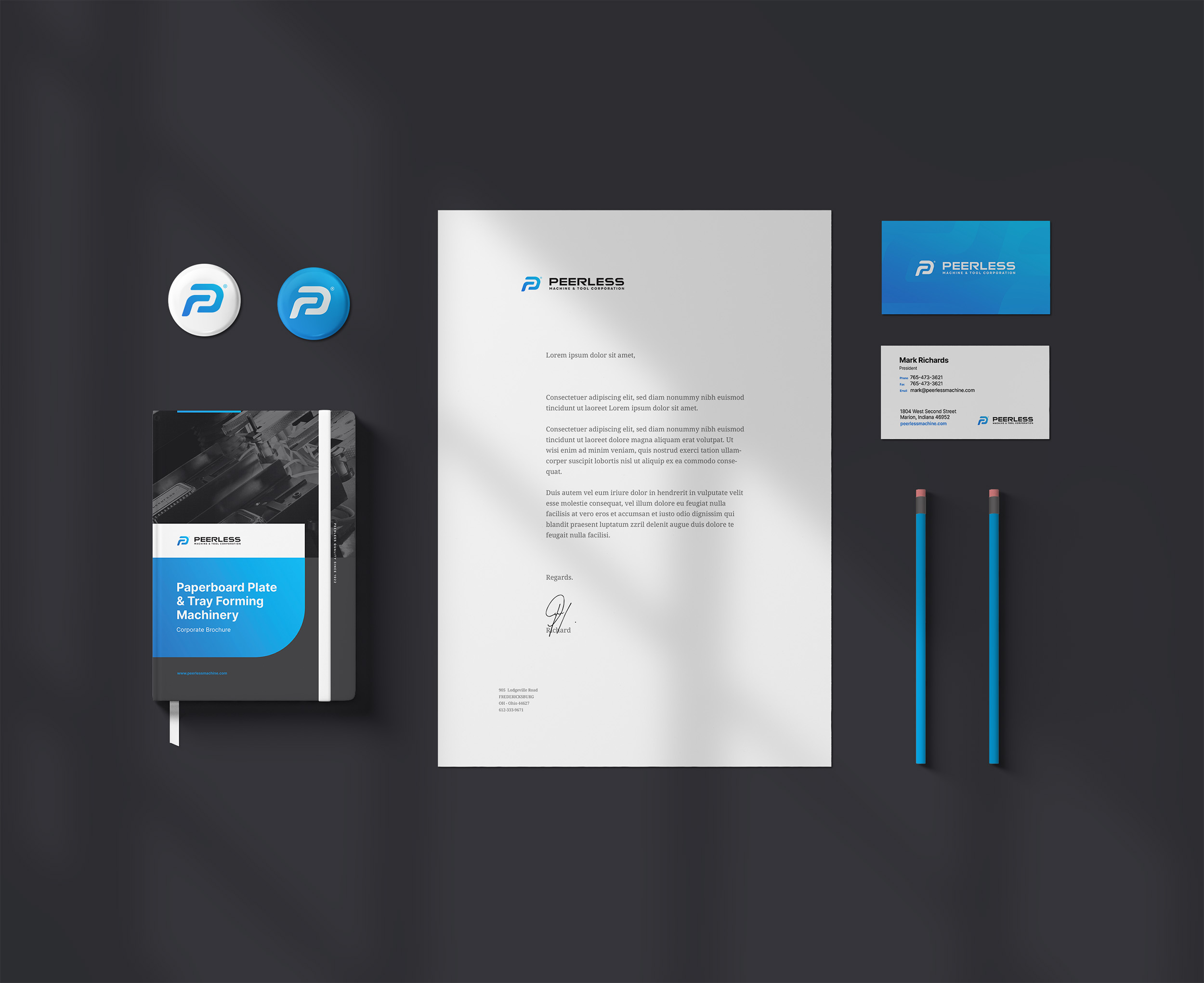

Corporate & Tradeshow Brochures
To support sales conversations, we designed a corporate brochure system that turns complex equipment capabilities into clear, confidence-building storytelling. Clean grids, technical diagrams, and parts photography anchor the content, while concise spec callouts make it easy for engineers and buyers to scan key tolerances and materials at a glance. The result is a sales tool that’s as polished and precise as the work it represents—easy to carry, easy to navigate, and impossible to ignore at events.

By unifying a modernized identity with purpose-built sales collateral, we gave Peerless a brand system that works as hard as their machines. The new monogram and wordmark deliver instant recognition across tooling, uniforms, and digital touchpoints, while the corporate/tradeshow brochure translates complex capabilities into clear, buyer-friendly narratives. Together, these assets tightened consistency, elevated credibility, and equipped the team with scalable tools that spark better conversations, drive RFQs, and position Peerless for its next decade of growth.
Related Projects